Friday, 11 May 2018

There is beauty in simplicity

Hello friends, lovely to see you come by here!
Today I have another journal spread to share:
I set myself the challenge to only use Tim Holtz products for this spread and had good fun digging out some of my newer and older Tim stash.

For the backgrounds I used two matching Vintage Wallpaper papers. (There are two of each design in the pack, in case you have not yet seen them). For some reason I seem to be attracted to pink right at the moment, which is weird as normally I don't really do pink, maybe it's because of all the blossoms outside.
For the left side, I just inked the paper a little, using Hickory Smoke Oxide and Normal Distress inks. I love how the Oxide version has almost a smokey pinky purple undertone, wile the normal DI is much more grey.
Next came the tag, again coloured with a mix of Oxide and Normal DIs, this time using Hickory Smoke and Denim inks. After some spritzing I used texture paste and the small rose layering stencil, coloured with Distress Markers once it was dry and then finished both the tag and the background with stamping, remnant rubs, a paper doll and some strips of Design Tape from the remnants set (my current favourites.
For the right hand page the wallpaper was altered quite a bit more. I used gesso to stencil with the Lattice stencils. I chose that one because it echos the design of the wallpaper a bit and also is my all time favourite of the layering stencils.
Next I used Hickory Smoke and Victorian Velvet DIs to do some inking and then a baby wipe for some further subtle stencilling, as it lifts some of the ink.
I then stamped right around the edges with Archival ink using the Etc stampset. (This is an idea I picked up from the ever so talented Vicky Papaioannou). I love how it frames the page.
This page was embellished with some butterflies from the Flutter set. First I stamped them directly onto the page using the stamp platform, and then again on card. I stamped in Hickory Smoke Oxide, clear embossed and then coloured with more of the same inks. I wished now I had not done that as it made the stamping rather fuzzy somehow, ah well, live and learn...
Finally I finished with some more washi tapes and a sentiment, stamped in the same way.
Some white splatters, done with some diluted white paint and a small brush, finished it all off.
I adhered both pages into my journal after I had irst inked around all the edges with more Hickory Smoke Ink.

Well, there you have it, another journal spread. As it includes both flowers and butterflies, I thought I would add this spread to the Art Journal Journey blog, where my lovely friend Jo is hosting the latest challenge which is Flora And Fauna.
Thank you for your visit like always and enjoy the weekend when it comes!
xxxxx

Monday, 7 May 2018

Just playing, - mixed media journal page

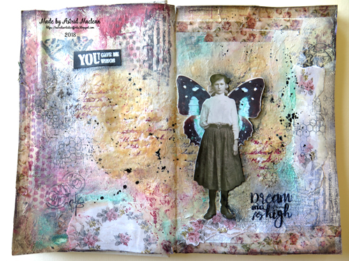
Hello friends, hope you were able to enjoy some fun time this weekend. Here in Scotland we had some glorious sunshine and I spent most of the weekend outside. But on Friday I had great fun playing in my journal, and here is the result:
I decided to try out some of my new stash and as I was too much involved in the process, I forgot to take any step out photos, but will talk you briefly through what I did.
I started by gathering various collage papers, paper serviettes, torn book pages and some scraps of the ideaology worn wall papers. I added them to my pages with fluid matte medium and then added some journalling using a biro with the plan to just have it there as a layer and cover it mostly with gesso, jsy peeping through here and there... BIG MISTAKE!! No matter how many coats of gesso and paint I threw at it, it kept coming through. So in the end I had to add more papers and some of the new Seth Apter baked textures, the Vintage Beeswax one, stamping into it while still hot.
I stamped into it while it was still hot and also added further background stamping, using Seth Apter and AAL &Create stamps.

I added some of Tim's new Washi tape from the Remnants set, which matches the worn wall paper scraps I chose in colour rather well, and added further patches of colour using Paper Artsy paints and Distress Crayon, as well as some dark brown Gelato arround the edges.
The spread was becoming rather busy so I added a paper doll with some butterfly wings to act as a focal point and draw in the eye a bit.
And finished with a couple of sentiments, one stamped in black and the other white embossed on black card, both from the AAL&C stamp set and some splatters finished it all off.

Well that's it for today. Thanks so much for your visit and I hope you'll get some fun playtime this week.
Have a good one!
xxxxx


Friday, 4 May 2018

Dance to the music of your soul for A Vintage Journey

Hello friends and welcome! Today it is the first Friday of the month and that means a new challenge at A Vintage Journey.
The wonderful Alison  who is our host this month, chose Words and Music as her theme, and this is the project I created:
This is what Alison said about her challenge:
-->For this challenge we would love to see projects that are inspired by your favourite song or that incorporate musical lyrics or sheet music in their design. Just remember to create your project in our preferred styles of vintage, shabby, mixed media, art journaling, industrial, timeworn or steampunk.

Unfortunately I have no step out photos, but will try to talk you briefly through my process.
I used the largest of the Tim Holtz wooden Vignette boxes for the base of my project and glued a piece of  49 and Market design paper to the inside back. Next I added some scraps of Tim's Aviary collage paper that have musical notes on them.
I then fussycut some flowers from the same paper and adhered them to the background on top of some scrap chipboard, to add a bit of depth. Finally I added my little dancer, who is, as most of you will know, one of Tim's paper dolls.
I gave her dress a little bit of subtle colour with a soft pink Gelato.

Some flowers and curly wire from my stash were adhered with the help of a gluegun and that was the inside finished.

I painted the sides and top of the box in pale coloured acrylics, added Decoart Crackle Glaze and when that had cracked highlighted the cracks with Dark Grey Antiquing Cream. I also added a few strips of washi tape from the Prima Lavender collection, to make it all a bit more feminine.
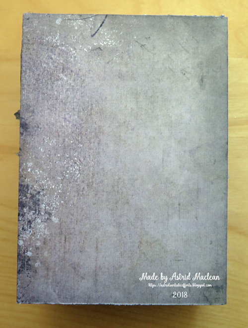
The back of the box was simply covered with another piece of the same design paper, all I did was darken the edges a little with Hickory Smoke Distress Ink.

So now to the front:

I cut another piece of the design paper to size and then made an aperture in the middle using the largest of the Tim Holtz Thinlitz Stacked Archway dies. I added a tiny bit of stencilling to the top using Tim's musical notes stencil,  adhered it to the front and decorated with the washi tape and some embellishments from my stash.
And finally a little computer generated sentiment to go with the little dancer and the music theme.

Well, that's pretty much it. Do have a look at what my talented teamies have created at A Vintage Journey. And of course we would love it if you decide to play along with our challenge!
Thank you for your visit like always, - have a great weekend and happy creating!
xxxxx


Tuesday, 1 May 2018

Rusty, May project for the Miixed Media Monthly challenge #48

Hello lovely visitors and welcome. Hope you are all enjoying some sunshine! This being the first of the month, I have two posts going live today, and here is my one for the Mixed Media Monthly challenge where our theme this month is "Rusty".
I love rust, so this was a joy to create, and even better, our sponsor this month is Emerald Creek

 who are offering a prize package of 3 of Seth Apters Baked Textures and 3 of their other powders, - so what are you waiting for, - do play along!! And remember, do add our graphic, - here it is:
On to my project:

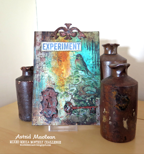
I created a canvas for this challenge and started with an abstract background painting using Golden Fluid Acrylics, Oxide ink and a Distress Crayon.
Next I added interest by using a scrap of the new Tim Holtz Collage papers (Aviary), some washi and ofcourse a couple of the Baked Textures which Emerald Creek had kindly sent the designers. I got Rust and Rocky Road and used them together for my projects. Below a close up of the amazing effect these powders can create:
My next step was to create some rusty embellishments:
This was a chipboard piece from my stash. I covered it in embossing ink and then added first Rust and then Rocky Road to get the effect.
This piece was a stamped image from a stampset designed by Seth Apter (Eclectica ESA08 by Paper Artsy). I stamped it in black archival ink, cut it out, covered it with embossing ink and then triple embossed with the two powders, added some patina effect with the help of a Distress Crayon and voila, a rusty lock.
Well, obviously a lock needs a key, and luckily I found a chipboard one in my stash and it got the same rusty treatment.
Then all I needed to do was add some background stamping, using stamps from the same stamp set by Seth Apter and I was done.
And here the same canvas in a different setting:
I am sure many of you will have played with these Baked Textures already, but having been away on a blog break, this was my first experiment with them, so I named my canvas Experiment (using another stamp from the same set).

Well, that's it for today, - thank you for your visit and do hop over to our challenge blog to see what my talented teamies have created and to get all the details of the challenge. Hope to see you there!
xxxxx

Small Notebook for the Mini Album Makers challenge

Hello friends, hope you are well and happy and Happy May!
I just recently returned from a trip to Australia and before I left I made myself a small notebook to take along and today I want to share with you how I made it:
I made the cover following various faux leather tutorials on youtube.
For those of you, who are new to this technique, this is how you go about it:
You will need:
Good quality Kraft card
A spray bottle
A bottle of Glycerine ( cheaply available from chemists)
An embossing folder
Distress Inks in brown tones (I used Vintage Photo and Ground Espresso), and if you want to add patina highlights you will also need a patina coloured art crayon (I used a Cracked Pistachio Distress Crayon).
1. start by making a mix of one part glycerine to approx 5 parts water in your spraybottle.
2. Cut your craft card to the desired size to fit around your notebook.
3. Spray your glycerine mix all over your card and then rub it in with your fingers. Do this on both sides. When it is well soaked in, crumble your card into a ball and then flatten it out again. Repeat this process about 3 times, making new creases each time and then rub over the creases with your chosen ink pad colour. It should now look something like this:

4. Fold your card in half and dry emboss each side with the help of an embossing folder. (I used a Spellbinders 3D embossing folder, but any folder will do).
5. Rub over the raised bits with your inkpad again and then spray lightly with water to make the ink run slightly.
6. If you decide to add some patina highlights, rub over some raised bits with your crayon. I chose  also to add a little metal embellishment that I also gave the patina treatment, and with that the cover was pretty much done.
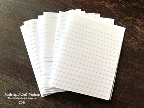
7. For my inside pages I chose to use simple note paper like this:
8. I chose the simplest, yet effective way of binding my pages together: Simply adhere the front of one folded page to the bottom of the next until you have the desired thickness.I would recomment using a glue runner or gluestick as wet glue would bubble thin papers like this too much.
9. Once you have you have your desired thickness of glued together pages, use some sports tape (again available from many chemists) to strengthen the spine of your pages and hold them all together. This is a trick I learnt from Birgit Koopsen who uses this binding method for her artjournal pages HERE is a link to a video where she shows exactly how to do it.
10. Now it's time to attach the cover to the pages: I simply folded my leather look cover around the inside pages and then glued the top page to the one side, and the bottom page to the other side. The final step was to cover those pages with some pretty design paper so that it is neat and firmly held in place..
The beauty of this way of binding a book is that there is absolutely no sewing involved and with thin writing paper like this there is no chance of the thread ripping the paper.
My little notebook is now filled with memories, notes and ideas.
Hope you like it, and if you ever want to create your own notebook, I highly recomment this method as it is really quick and easy to do.

Well, that's it for today's tutorial. We hope you will share your own books and ideas with us on the challenge blog, and meanwhile please take a peep at some of the albums my talented teamies have created and catch up on all the details of our challenge this month. Hope to see you there!
xxxxx

Related Posts Plugin for WordPress, Blogger...

One World One Heart

Photo

FEEDJIT Live Traffic Feed

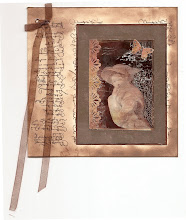
Birthday Card

Birthday Card
Just got a whole lot of new stamps from a brilliant place called the Stamp Smith. This is the image that I first saw on Docraft and really liked. I asked the friend who has used it in an ATC, where she got it. Well she borrowed it from a friend who got it from ebay as a one off. But.... it had a title. I googled the title, and hey presto found the site. They have great stamps and offer a really friendly fast service. I highly recommend them!

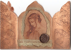
Gothic Arch Trifold inside

Gothic Arch Trifold inside

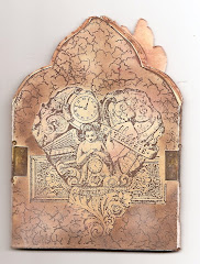
Back of Gothic Arch Trifold

Back of Gothic Arch Trifold

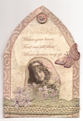
Gothic Arch Within the Heart

Gothic Arch Within the Heart

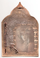
Gothic Arch, the Key

Gothic Arch, the Key