Showing posts with label Art Journal. Show all posts

Friday, 6 July 2018

Get sentimental for a Vintage Journey

Hello friends, it's the first Friday of the month and that means a new challenge starting at A Vintage Journey. The talented Nikki has chosen the theme "Get Sentimental", and this is what she would like you to do:
Let's see lots of sentiments on your project, whether they be words, poems or quotes. Just remember to create your project in our preferred styles of vintage, shabby, mixed media, art journaling, industrial, timeworn or steampunk.
Well I decided to create a journal specifically to use quotes and also to experiment with different mediums and styles.
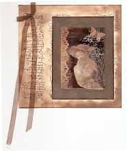
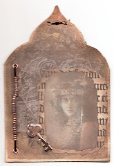
Here first of all is the cover:
I had this piece of Stamperia London themed rice paper hiding in my stash and decided to use it for my quotes journal. I also wanted to finally put some of Lynne's Affirmations stamps and stencils to use, so that was my starting point.

I cut two pieces of scrap card to just over 6 x 8  and covered them with the paper. I then cut  7 pieces of A 4 water colour card, folded them in half to form signatures. I sandwiched them between the two bits of card and then wrapped a bit of sports tape tightly around the spine side right along the length. The sports tape is so sticky it holds the pieces in place, so super easy. Then all I did was glue a spare bit of the rice paper over the spine, and that was it.. If ever one of the signatures get loose, you can always hold it in place with some washi or design tape.
Once everything was held together I started to decorate the front cover a bit further.
I wanted to try and get a sort of faux encaustic technique both on one of the inside pages and on the cover. For the cover, I first of all stencilled one of the sentiments of the affirmations stencil with white opaque embossing paste and when that had dried covered the whole cover with a thick layer of thick Matte Medium, using a pallet knife and scratching into it a bit for some additional texture. I then let it dry overnight.

 My new Tim Holtz 3D embosslets had just arrived, so they were put to good use to embellish the cover. I cut them from Kraftcard, coloured them with Distress inks and then highlighted the raised bits with some Whitefire Treasure Gold.
Some of the textural bits in the now dry medium were further highlighted with some Distress Crayon in Cracked Pistachio.

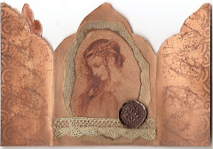
The inside of the covers were covered with some Prima Design papers I had in my stash, I just inked, stamped and gessoed them a bit and then added another sentiment to the front one, using the stencil once more.
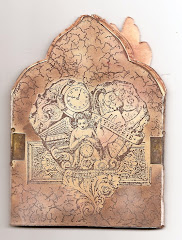
Alright, onto the first of the journal pages, another faux encaustic experiment that I messed up rather...
There are numerous layers on this piece, paints, inks, washi tape, gesso etc and then I stamped some of the affirmations stamps onto tissue paper and added them too before covering everything in the thick medium again.
The sentiments got lost against the background, I tried to rescue that by outlining with a stabilo all pencil, but I am still not happy with the result.....
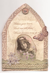
So the next double page was done in a very different style:
I often use this style in my daily and bullet journals, using washi tapes, stamping and stencilling, but again, in this size of journal, the sentiments got lost a bit....
Here are a few close ups still:


I added a few drops of sealing wax for some extra highlights...
I absolutely love these stamp sets, the sayings and additional images that come with them, but ultimately I think they would work better on a smaller format journal or cards/tags.

My final spread is a combination of the previous two: These pages were done in a similar way, Using paint for the background and then adding other elements, background stamping and some of the wonderful bugs from the Tim Etymology set, stamped on tissue paper. To give Lynne's affirmations a bit more prominence I stamped them on scraps of paper first.
And a couple of close ups, to finish it all off:

This time for the faux encaustic I used Transparent Texture Paste, this worked better and if ever I wanted a slightly more waxy look I would probably just add a tiny bit of paint...

Well, that's it, sorry for this mammoth post, thanks for dropping by like always, and if you have not done so yet, do check out the projects of my talented teamies, tons of "get sentimental" inspiration for sure.
xxxxx


Friday, 11 May 2018

There is beauty in simplicity

Hello friends, lovely to see you come by here!
Today I have another journal spread to share:
I set myself the challenge to only use Tim Holtz products for this spread and had good fun digging out some of my newer and older Tim stash.

For the backgrounds I used two matching Vintage Wallpaper papers. (There are two of each design in the pack, in case you have not yet seen them). For some reason I seem to be attracted to pink right at the moment, which is weird as normally I don't really do pink, maybe it's because of all the blossoms outside.
For the left side, I just inked the paper a little, using Hickory Smoke Oxide and Normal Distress inks. I love how the Oxide version has almost a smokey pinky purple undertone, wile the normal DI is much more grey.
Next came the tag, again coloured with a mix of Oxide and Normal DIs, this time using Hickory Smoke and Denim inks. After some spritzing I used texture paste and the small rose layering stencil, coloured with Distress Markers once it was dry and then finished both the tag and the background with stamping, remnant rubs, a paper doll and some strips of Design Tape from the remnants set (my current favourites.
For the right hand page the wallpaper was altered quite a bit more. I used gesso to stencil with the Lattice stencils. I chose that one because it echos the design of the wallpaper a bit and also is my all time favourite of the layering stencils.
Next I used Hickory Smoke and Victorian Velvet DIs to do some inking and then a baby wipe for some further subtle stencilling, as it lifts some of the ink.
I then stamped right around the edges with Archival ink using the Etc stampset. (This is an idea I picked up from the ever so talented Vicky Papaioannou). I love how it frames the page.
This page was embellished with some butterflies from the Flutter set. First I stamped them directly onto the page using the stamp platform, and then again on card. I stamped in Hickory Smoke Oxide, clear embossed and then coloured with more of the same inks. I wished now I had not done that as it made the stamping rather fuzzy somehow, ah well, live and learn...
Finally I finished with some more washi tapes and a sentiment, stamped in the same way.
Some white splatters, done with some diluted white paint and a small brush, finished it all off.
I adhered both pages into my journal after I had irst inked around all the edges with more Hickory Smoke Ink.

Well, there you have it, another journal spread. As it includes both flowers and butterflies, I thought I would add this spread to the Art Journal Journey blog, where my lovely friend Jo is hosting the latest challenge which is Flora And Fauna.
Thank you for your visit like always and enjoy the weekend when it comes!
xxxxx

Friday, 12 January 2018

The world is full of magic things

Hello friends, - today I have another journal spread to share, this time nothing to do with Lifebook 2018. I started this weeks ago in my Jane Davenport journal, and finally got round to finishing it.
The background was created first, using a mix of collage, acrylic and watercolour paints. I then added the girl with the help of water soluable crayons, Tombow markers and Prisma colour pencils, plus some Stabilo all pencil and marker pen to add more detail.
The face turned out quite patchy, because of having done the background first. I also really need to get some flesh coloured acrylic paint.....

I added a hand lettered quote that I found on Pinterest I think. I love the thought behind it, trying to paint portraits certainly make you look more closely at faces, and the human face, particularly the eyes, always fill me with wonder.
Here is a close-up of the background. After having completed the face I added some stamping and stencilling.
A little tiara on her hair and a scrap of a paper napkin, finished it all off.

Well that's it for today. I will probably be back with a few more Lifebook creations in a few days time.
I will add this piece to the lovely ladies at AJJ  again
Meanwhile, thanks for your visit like always.
xxxxx

Tuesday, 9 January 2018

Garden Fairy, Lifebook 2018 no 2

Hello friends, before I share today's piece I woudl like to welcome all the new followers who have joined me since the beginning of this year. Thank you so much for joining me here. I also want to thank you for your kind comments on my previous page.

Today I am ready to share my next page, which is more coplex, though using many similar techniques. Again I can't really share them, as they are part of the Lifebook 2018 classes, but as you can probably see I have stepped right out of my usual comfortable colour scheme....
I love painting these kind of semi realistic portraits, but always have a hard time showing them, as there is so much I still need to learn, but of course, that is partly what this journey is all about.
I also attempted some hands (so hard) and my little bird, part of my chosen theme for this year, makes an appearance again too.
I am not really into "cute", but I do love whimsical, so a few whimsical houses make an appearance also....
And finally some stars in the background, I love stars, they did not quite come out the way I wanted, - but so be it.
Well there you have it, - I followed some of Tamara's example but then pretty much went my own way, just using her techniques for inspiration.

So that's it, my garden fairy, who is meant to be my muse for the coming year, whether she will or not will remain to be seen, - but one thing is certain, I am really enjoying Lifebook, and would highly recommend it to anyone looking for some new art inspiration this year.

I am linking this piece to Art Journal Journey were this month's theme is "New Year New Adventures"
Thanks for coming by like always, and happy creating!
xxxxx

Friday, 10 June 2016

Our House for Paper Artsy

Hello everyone and thanks for coming by. Tonight I am excited to share a project over on the Paper Artsy Blog, where the theme at the moment is "Our House".
I chose to take quite a free interpretation and created a journal page incorporating words that express how I feel about my home that I love.

Here is just a little peek, the full project and process steps can be found on the Paper Artsy Blog


While working on the page for Paper Artsy, I created a second spread too, using the same sets of stamps, Ink and the Dog ID 09 and Eclectica ESN 18. I used very similar techniques for this one,but I like the one on the PA blog a little better, 
 I would like to thank Darcy and Leandra for inviting me to post on their blog, it was an honour to do so. Hope you'll take the time to hop over and have a great weekend when it comes!

Monday, 16 November 2015

Journal page for Calico Craftparts

Hello all, thank for dropping in.
I am sharing a journal spread over on the Calico Craftparts Blog today.
A mixed media background, some crackle and of course some craft part are all in the mix. Hope you'll take the time to check it out :o)
All you need to do is CLICK HERE
Thanks for coming by and have a fab creative week!!

Sunday, 5 October 2014

Dragonfly dreams

Hello everyone
After a few days of sharing samples for Sheena Douglass's shows on Create and Craft using the Aqua tints, I wanted to share a journal page with you using the tints in a very different way, and just having great fun.
I'll give you a quick run down on how I went about doing this page.

It started with a page in my journal that I was not totally happy with, so I covered it with Gesso, spreading it on with a pallet knife and adding some strips of book paper
You can see a few bits of colour showing through still, but that did not bother me.
Next I started to splash about with some of the tints, just playing and seeing how they would puddle over the gesso texture. I added a tiny sprinkle of Bister powder also in two places and they mixed beautifully.
Love the combination of the aqua and brown and blackish tones and how the Aquatints seems to take on a life of their own, specially when you spray them with water a bit. Below is a close up:
I added some background stamping with some Prima stamps and then took some water colour paper, a Tim Holtz stencil, and some texture paste. Once that had dried I prayed it with the same colour tints, but this time in a spray bottle. I die cut and embossed the Tim Holtz Dragonfly and adhered that to the background, sprayed it with the same colours and then highlighted the raised bits with some Treasure Gold.
Next I adhered that piece to the centre of my journal page with mat medium and  added some tissue tape and more background stamping to intergrate it into the rest of the page.
I felt it needed a bit more still for added interest, so I took some previously made backgrounds in which I had used similar colours and die cut leaves from them, using some of my Spellbinder leaf dies.
Not very realistic in colour, but I really wanted to keep the page kind of tone in tone, so just decided to go with it.

I added them to the page together with a slightly adapted quote by Wendell Berry that I love,  and that was it.
Quite a simple page really, but I had fun creating it.

Here is the original quote:
When I rise up
let me rise up joyful
like a bird.


When I fall
let me fall without regret
like a leaf.”

Happy Sunday to you all and thanks for visiting!

Related Posts Plugin for WordPress, Blogger...

One World One Heart

Photo

FEEDJIT Live Traffic Feed

Birthday Card

Birthday Card
Just got a whole lot of new stamps from a brilliant place called the Stamp Smith. This is the image that I first saw on Docraft and really liked. I asked the friend who has used it in an ATC, where she got it. Well she borrowed it from a friend who got it from ebay as a one off. But.... it had a title. I googled the title, and hey presto found the site. They have great stamps and offer a really friendly fast service. I highly recommend them!

Gothic Arch Trifold inside

Gothic Arch Trifold inside

Back of Gothic Arch Trifold

Back of Gothic Arch Trifold

Gothic Arch Within the Heart

Gothic Arch Within the Heart

Gothic Arch, the Key

Gothic Arch, the Key