Sunday, 5 October 2014

Dragonfly dreams

Hello everyone
After a few days of sharing samples for Sheena Douglass's shows on Create and Craft using the Aqua tints, I wanted to share a journal page with you using the tints in a very different way, and just having great fun.
I'll give you a quick run down on how I went about doing this page.

It started with a page in my journal that I was not totally happy with, so I covered it with Gesso, spreading it on with a pallet knife and adding some strips of book paper
You can see a few bits of colour showing through still, but that did not bother me.
Next I started to splash about with some of the tints, just playing and seeing how they would puddle over the gesso texture. I added a tiny sprinkle of Bister powder also in two places and they mixed beautifully.
Love the combination of the aqua and brown and blackish tones and how the Aquatints seems to take on a life of their own, specially when you spray them with water a bit. Below is a close up:
I added some background stamping with some Prima stamps and then took some water colour paper, a Tim Holtz stencil, and some texture paste. Once that had dried I prayed it with the same colour tints, but this time in a spray bottle. I die cut and embossed the Tim Holtz Dragonfly and adhered that to the background, sprayed it with the same colours and then highlighted the raised bits with some Treasure Gold.
Next I adhered that piece to the centre of my journal page with mat medium and  added some tissue tape and more background stamping to intergrate it into the rest of the page.
I felt it needed a bit more still for added interest, so I took some previously made backgrounds in which I had used similar colours and die cut leaves from them, using some of my Spellbinder leaf dies.
Not very realistic in colour, but I really wanted to keep the page kind of tone in tone, so just decided to go with it.

I added them to the page together with a slightly adapted quote by Wendell Berry that I love,  and that was it.
Quite a simple page really, but I had fun creating it.

Here is the original quote:
When I rise up
let me rise up joyful
like a bird.


When I fall
let me fall without regret
like a leaf.”

Happy Sunday to you all and thanks for visiting!

Friday, 3 October 2014

Nearly show time!!!

Hello everyone and lovely to see you here. Tomorrow is the launch of the new and wonderful Aquatints on Create and Craft with demonstrations by Sheena Douglass.

To read more about the tints and see further samples, please click HERE.

Some more samples of what I made below:
 Tints applied with the included brushes. Stamps from the Northern Lights set.
Using the salt technique with the tints, then stamps (from the Northern Lights set) stamped in Walnut Stain Distress inks and then using the faux bleach technique on the rocks to add more depth to them. Flower coloured with the tints.

Background using salt technique again, but this time using coarse salt, so that some texture remains. Wolf white embossed on tissue paper, everything else also coloured with the tints.
Make sure to tune in tomorrow at 9am, trust me, you don't want to miss this!!!

Have a wonderful weekend when it comes, and thanks so much for visiting!

Wednesday, 1 October 2014

Go Rust-ic for Our Creative Corner

Hello everyone and happy October to you all. Like usual on the first of the month I have a couple of posts to share with you, so if you are here for the second time today, thank you for doing so.

At  Our Creative Corner, the theme this month, chosen by the lovely and very talented  Laura is "Go Rustic"

This is what Laura had to say about the challenge:
"I really love Autumn and find it very inspiring with all those textures and colours we see in nature right now. So I decided to bring those textures and colours into a challenge here and see all that rustic creativity at Our Creative Corner!
We want to see a huge variety of items, so make anything you like - but add some RUST!
Now you can take this Rust-ic creativity to any level you like - You can use just use some rusty autumnal colours or you can really go for it and work with gorgeous, rough textured, grungy, real or faux rust.
So.....How 'rusty' are you?"....

I decided to share a journal page using my beloved Autumnal colours and of course some rusted elements. There was no real plan to the page, it just evolved:
The page started life as a mop up page with left overs from other projects, so I cannot quite tell you what is on there.

 Acrylic paint in a variety of makes and colours, including Distress Paints in Rusty Hinge, some twinkling H20s and some Distress Stain in Walnut stain were definitely in there somewhere. I used baby wipes and kitchen roll, mopping up from my craft mat over various days, just adding more layers whenever I had paint left over that I did not want to go to waste.
When I decided to use this page as the background for my rusty creation I decided to add some texture with the help of a Prima stencil and  some Wendy Vecchi translucent texture paste. When that had dried I added some Bister in brown and some strips of tissue tape. I also did some background stamping with various Prima stamps. Next I prepared my rusty piece...
I took a piece of corrugated packaging from a ripped up box and started to play with Crafty Notions Rusting powder and Antiquities embossing powders in Rust and Verdigris.
As I had my box of Prima stamps out already anyway, I took two of the lovely Finnabair stamps, stamped them on thin card in Coffee Archival, scrunched them up and then inked with Antique Linen and Vintage Photo Distress inks and voila, two bits of old looking ephemera.
It needed a kind f vocal point, so out came a leaf, cut with the new Tim Holtz Layered Leaf and embossing folder. I coloured with a mix of Distress Stains and added some more "rust" with the help of the embossing powders.
I had this metal bee flying around on my desk, so it too got the rusting treatment and then I started to layer it all up.
As you can see, in the end I decided to also add a few flowers still and a sentiment. The flowers were made using a Heartfelt Creations stamp and die from the new Classic Sunflower collection, and that was pretty much it.
Here are a few close ups still:
The sentiment was cut from one of the papers of the Classic Sunflower collections, if you have not seen it and you like papers, check it out, it's gorgeous!
I added some bits of greenery still, again, leftovers from other projects.
I also added a second leaf still, this one is a Spellbinder die.
Well, that was it, I had great fun playing in my journal and I hope you like it. It turned out rather brighter than most of my other projects, but hey, it is Autumn after all and we are surrounded by oranges, browns and reds, so I guess they influenced me.

Thank you for visiting like always and I hope you will have some creative time too. Do check out the wonderful projects from my team mates, all you need to do is click HERE and hopefully you will feel inspired to play along!

Sparkle and Shine or the dreaded C word....

Hello everyone and welcome! Can you believe it is October! Yes, there is no getting away from it, the nights are drawing in, specially up here in Scotland, very soon it will be dark already around 4 o'clock. But October does not only mean shorter days and Halloween, it also means Christmas is less than 3 months away....

Anyway, the theme at Countryview Challenges is Sparkle and Shine. So the moment I saw the theme I knew this would be the perfect chance to start on my Christmas cards.
I decided (like quite a few of us I think) that I would keep my Christmas cards simple and without too many embellishments.
I started by cutting a piece of strong white card to 3.75 by 5.75 " and coloured by blending Chipped Sapphire all around it. I then used the Tim Holtz Holiday Knit stencil and more Chipped Sapphire to do some stenciling at the top and the bottom.
I added some drops of Diamond Stickles to the centre of the patterns for more sparkle.

Next I gathered the other elements I wanted to add:
Some Kraft card for the backing, a layered snowflake die cut on which I had used a lot of Clear Rockcandy Dry Glitter (impossible to see on the photograph) and a stamped sentiment from the Tim Holtz Mini Holiday set. I layered it all together and that was really all there was to it. Quick and easy, just what we want when doing Christmas cards....

Here you can perhaps see the snowflake a little better. I layered a second one, lightly coloured with Stormy Sky and Gathered Twigs on top of the first one. There is a lot of sparkle and shine on the flake, but it is impossible to get a good photograph I found.

Well, hope you like my Christmas card and that you will decide to play along with our challenge. You can read all about it by clicking HERE and of course there is some amazing further examples to the theme, including more Christmas cards, from the rest of the team.

Thank you for visiting, and this being the first of the months, I will be back with another project a little later.


Monday, 29 September 2014

Exciting new product!!!

Hello everyone, hope you are all well and happy!
It's been rather quiet here because I have been busy preparing samples for the new Create and Craft weekender shows this coming weekend, in my position as a member of the Sheena Douglass design team.

We are launching a superb, exciting and versatile new product, called Aquatints. I'll start by showing you some samples and will then tell you more:)
 No 1. Texture added with texture paste then coloured with the tints

Close up of the texture with the tints creating lovely patterns

No 2. Tints on water colour paper, the bottom half is a stencil that will also be on the show

3. Mixed media hanger, tints mixed with gesso, stamps from the Northern Lights set included in the show.

Alright, so what are these tints? They are bottles of highly concentrated water colour, there are several sets and each set comes with brushes and droppers included. There are Brights, Pastels, Essentials and Grunge sets. Each set has 6 different gorgeous colours.


To be honest, when I first got them I thought, ok, so what makes these so different from say the Dylusions sprays? Well, one of the differences is that they come in ink type bottles, with the droppers and brushes included, you can splash and drip, blend or wash to your hearts content. And of course there is nothing to stop you adding them to a spritzer bottle and using them as sprays too. The droppers make that a really easy thing to do. The Essentials set includes a fairly opaque white, brilliant to mix with other colours to get opaque like pastel colours. It also includes a gold and silver which are opaque, you can either use them as is, for some real bling, or again mix a few drops in with other colours to get an amazing shimmer. Mix any of the colours with gesso and you get a stunning chalk paint like finish, great for stamping on. You can mix them with acrylic paints and use them on your gelli plate, they are brilliant to dye ribbon or flowers with and I could go on and on, I bet I have not discovered the half of them and can't wait what clever techniques Sheena will be showing this coming weekend. Make sure to tune in to Create and Craft this coming Saturday, it is a weekender, so there will be several shows, the first one will be at 9 am.


Thanks for visiting and have a great week!


Friday, 26 September 2014

A Sad Goodbye

Hello lovely visitors, thanks for dropping in here.

It is with a heavy heart that I write this post as today is the day I will be sharing my very last post for The Artistic Stamper.

I have been on the team for two and a half years, and I have decided that it was time to move on. Life is taking me in different directions now, and something just had to give.

I have thoroughly enjoyed being on the team there and to work with The Artistic Stamper's wonderful stamps, so today I am sharing a review of some of the many projects I have created for them over the years. If you have time, take a look....

I want to thank Jennie the Artistic Stamper and all my teamies, old and new, I am sure we will stay in touch. Thanks to you lovely visitors also for all your support!!

Tuesday, 23 September 2014

A project in Progress

Well, this last weekend I had some time to play and make something just for myself. It's going to be a mini book, with 6 double pages and pockets all over the place. As you can imagine, a lot of work and a lot of photos to show, so I thought I would share it in stages.
The binding for the mini, which will hold family photos of my grand children, will be the so called "stack the deck" system, devised by the amazing Laura Denison. If you want to know how to do it, just click the link and it will take you straight to the video.

I am using the Heartfelt Creations Classic Sunflower paper collection that I fell in love with the moment I saw it. I made my mini out of handmade envelopes made with the paper collection. By trimming a small bit off the end on one side you then have a pocket for tags etc.

Anyway, there are loads and loads of tutorials out there on how to do these things, so I am just going to show you the pages and tags I have done so far.
Above is a page on which I created a little corner pocket for a small journaling spot and photo.
Here is the tag, - I love altering papers with stamping and stenciling.
This is one of the large tag that fits into the side pockets. I am going to make them all the same shape, they happened to be just the right size to use the strips of paper that were left after making the envelopes. The top is shaped with a Spellbinder die, the little lattice embellishment is a Sue Wilson die, I am going to add a little title relating to the photo in the center of it.
The back of the envelope, the flower was made with a stamp using another Heartfelt Creations collection.
The front of the next envelope, this one just has a side pocket. The image is a stamp from the Sunflower collection, I couldn't help but order a couple of the stamps when I got the papers....
The back of the envelope, again, flowers made with  Heartfelt Creations stamps. Some of the other embellies are from the Graphics 45 Place in Time collection.
The final envelope I have done so far, a pocket on the front this time, with a photo mat again.
Here is the back of the same envelope, again with a pocket at the front.
And here finally are the two tags that fit in those pockets, each decorated with Heartfelt Creations stamps. Oh and all of the colouring of the stamps was done with Prisma pencils.

Well, hope you like what I have done so far, more will follow as time will allow, including the cover.

Thanks for visiting like always and I hope you will find some time just to create, - it's good for the soul I'm sure!

Sunday, 21 September 2014

A Box full of Hope...

Hello all and welcome.
As some of you know, I live in Scotland and this has been a very special week for us all here.
 It started full of hope and excitement, and for many of us ended with a feeling of sadness for lost opportunities. But life must go on and new opportunities will come in different ways, Scotland will rise from the ashes like a phoenix.....

It seemed pertinent at the beginning of this new week to show you a project made with one of the new stamps designed by Sheena Douglas. This time I made a box using the beautiful Phoenix stamp and one of the sentiments that come with the set.

Some of you may have seen her show and all the new stamps last Friday on Create and Craft. There are 6 different sets of stamps, I had three sets to play with and will show you some other projects still in the following days. You can purchase the stamps either from Create and Craft of from Crafters Companion.

I made the box from Kraft card, created a background with Distress inks, Twinkling H2O some sprays and using the salt technique.
I stamped the phoenix with Versamark and then embossed with copper embossing powder. I coloured the phoenix with twinkling H20s and  adhered it to the box with foam tape for some extra depth. I then embellished with some flowers and the sentiment stamped in copper as well. 

Happy Sunday and have a good week ahead!

Related Posts Plugin for WordPress, Blogger...

One World One Heart

Photo

FEEDJIT Live Traffic Feed

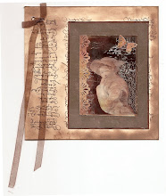
Birthday Card

Birthday Card
Just got a whole lot of new stamps from a brilliant place called the Stamp Smith. This is the image that I first saw on Docraft and really liked. I asked the friend who has used it in an ATC, where she got it. Well she borrowed it from a friend who got it from ebay as a one off. But.... it had a title. I googled the title, and hey presto found the site. They have great stamps and offer a really friendly fast service. I highly recommend them!

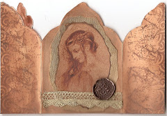
Gothic Arch Trifold inside

Gothic Arch Trifold inside

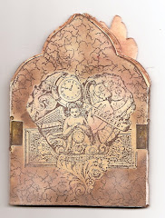
Back of Gothic Arch Trifold

Back of Gothic Arch Trifold

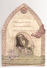
Gothic Arch Within the Heart

Gothic Arch Within the Heart

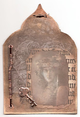
Gothic Arch, the Key

Gothic Arch, the Key