Showing posts with label Sheena Douglas. Show all posts

Friday, 22 March 2019

A new week, a new page and some faux leather

Hello friends, it’s Friday and that usually means a new post from me. So this week I have my new calendar page to share and also a little mini travel journal with a faux leather cover and insert, all made from scratch.
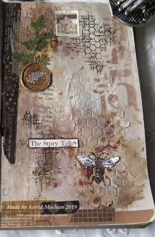
Here first of all are some photos of the new calendar/planner spread, - when I took the photos it was only partially filled in.
The background was created with some Papper Artsy Fresco paint in Buff, mixed with some Decoart Media Trancelucent White, both of which were on my palette anyway from another project. I also added a few sprays of Vintage Photo Distress Oxide spray and quite a bit of water, all while the paint was still wet. I added some stencilling with a Tim Holtz stencil and Ranger translucent mat texture past and then I added some of my usual elements, stamping washis a wax seal etc.
The bee stamp is from a set by AALL&Create
Wax seal and dried leaf from my garden
Some of the washis were plain brown and I stamped them with Stazon Opaque white.
The sentiment is from one of Tim's word sticker collections. I always like to add some words to my pages. The scribbly stamp behind is also from the same AALL&Create set.
So far for the calendar page... I also made a tiny (6 x 3") travel journal, - I made it that size because I wanted to use the 6 x 6 Kaisercraft Pen and Ink collection papers, which when folded in half and trimmed a little, make for the perfect insert.
Here is the cover. I used a technique first learnt from Sheena Douglass, and rather than giving you a long winded description, here is a link to her Youtube tutorials for the process if you are interested.
I dry embossed the front
But left the back cover just plain, I actually like that better. The metal bit is actually a faux metal sticker purchased in the States a while back. Think it was at Michaels.
I added an extra strip for the spine to give it more strength, and used a really simple elastic closure. The inside was lined with fabric, like Sheena suggests.
A few photos of some of the inside pages, I have done many more, but I thought this post was long enough already...
Because the 6 x 6 papers I used are one sided, every other spread is always blank, which is of course perfect for journaling.
on one of the pages I added a little journal card, from Tim Holtz, but further decorated by me.
Here you can see the other side of the journal card

Well, that's it for this week. Sorry it's quite a long post, but at least I only post once week (grin)
Have a wonderful weekend and thanks for your visit
xxxxx


Thursday, 21 April 2016

A birthday card for little A

Hello lovely visitors, I hope you are all keeping well!
A super quick post from me today, just to share a birthday card I did for one of my grand daughters who will turn two soon.
Just a quick word of explanation: little Arielle loves her food, she also loves chickens, so with that in mind I put this card together. Also in Australia where she lives it is now Autumn, so that's the reason for the rather Autumnal colours.
Here is the inside:

The stamps I used are by Sheena Douglas, the papers and dies are mostly Heartfelt Creations.

I coloured the stamp with Derwent Inktense pencils and blended with a Dove Blender pen, which worked brilliantly, so I was very pleased with that discovery. Arielle has a little red rain suit just like the child in the foreground is wearing, and her sister Lucia has a coat not unlike the blue one the other child has on.
The birthday greeting is on the other side of the tag which is only adhered up to the fold line.

The card closes with a little flap and a little round velcro fastener. And for once, though I don't usually share family photos, here is a photo of her taken a few weeks ago.

Well that's it for now, thanks for your visit like usual and I hope you are having a good week.
xxx

Monday, 23 February 2015

When Tim and Sheena go out to play....

Hi everyone, lovely to have you joining me here for a bit.
Today I am sharing a quick tag..... Some of you have noticed that it's been a bit quiet here lately, yes I am not managing to post as often as I used to. There are many reasons for that, but one of them is that I have been very busy behind the scenes, creating for a new release of Sheena Douglass. But today I wanted to do something just for myself, using some of my new Tim Holtz goodies. As some of Sheena's things were still flying around on my craft desk, I thought I'd use these as well, but more in a Tim style.

Here are a few details:
I used one of my new Thinlits mixed media dies and layered up various bits and pieces. The background was made using Distress Spray Stains in Iced Spruce, Pumice Stone and Gathered Twigs. I then inked with the same colours and also added some embossing powders along the side. One of the new Photobooth images is the focal point, - love their size, and so many all in one pack, enough for hours of creating....
A ticket cut from some Prima Cartographer paper and a butterfly stamped in Potting Soil Archival from one of Tim's framelets sets,
A word from the new larger chit chat stickers, distressed and scuffed up a bit. A great size, I love them!
And here a couple of the new Sheena perfect partners dies and stamps (these were released in January already and are available from Crafters Companion). The dies match the stamps to perfection. I cut them from Prima cartographer paper again. and chose a heart charm that would match my colour scheme.
Well that's it for just now. You can expect to see lots of more traditional Sheena Douglass cards using her brand new, not yet released products as from the beginning of March. They won't be my usual grungy mixed media style, but hey, sometimes I love to step out side of the box and I had great fun creating them, - stay tuned....

Thanks for visiting today, and I will be back on the 1st of March with 3 projects..... hope to see you then and stay inky!!!

Friday, 10 October 2014

Believe in the magic

Hello everyone, thanks for dropping in....
Here is another journal page, using the new Aqua Tints I have posted about on several occasions now. I love these gorgeous bottles of concentrated water colour.

This page was just all about playing with the tints and some stamps (plus a few die cuts).
Whereas the last page was more monochrome, this one is more colourful, - child like, as really I was playing with ideas for a birthday card for my grand daughter, whose second birthday was last week. The stamps used are from one of the Sheena Douglass A Littlebit Magical sets, and no, this is not a DT piece, I just love the stamps and was having fun with them.
The background was gessoed with a pallet knife, leaving some textures and patterns for the tints to pool around in. The pumpkin is a Tim Holtz die, the mushrooms are from the stamp set, stamped on card, fussy cut and coloured with Derwent Inktense pencils.
Here you can see the magic of the tints ontop of the Gesso, their colour is just so intense. Oh the sentiment was just computer generated by the way.
The magical door way, stamped on tissue and then blended into the background. This is actually two separate stamps. I masked the doorway and then stamped the brick wall, turning the stamp the other way for the second side. Once you remove the mask, it looks as if the brick wall is behind the doorway.
When I did the birthday card I actually cut a slit in the door so it can open and put a fairy behind it, but in my haste to get it to Australia in time, I totally forgot to photograph it, so can't show you, but apparently she loved it....

Anyway, not your usual journal page, but good fun to do.
I am linking this to Art Journal Journey "deep in the forest".

Hope you will have some creative time, thank you for visiting and have a great weekend when it comes!

Friday, 3 October 2014

Nearly show time!!!

Hello everyone and lovely to see you here. Tomorrow is the launch of the new and wonderful Aquatints on Create and Craft with demonstrations by Sheena Douglass.

To read more about the tints and see further samples, please click HERE.

Some more samples of what I made below:
 Tints applied with the included brushes. Stamps from the Northern Lights set.
Using the salt technique with the tints, then stamps (from the Northern Lights set) stamped in Walnut Stain Distress inks and then using the faux bleach technique on the rocks to add more depth to them. Flower coloured with the tints.

Background using salt technique again, but this time using coarse salt, so that some texture remains. Wolf white embossed on tissue paper, everything else also coloured with the tints.
Make sure to tune in tomorrow at 9am, trust me, you don't want to miss this!!!

Have a wonderful weekend when it comes, and thanks so much for visiting!

Monday, 29 September 2014

Exciting new product!!!

Hello everyone, hope you are all well and happy!
It's been rather quiet here because I have been busy preparing samples for the new Create and Craft weekender shows this coming weekend, in my position as a member of the Sheena Douglass design team.

We are launching a superb, exciting and versatile new product, called Aquatints. I'll start by showing you some samples and will then tell you more:)
 No 1. Texture added with texture paste then coloured with the tints

Close up of the texture with the tints creating lovely patterns

No 2. Tints on water colour paper, the bottom half is a stencil that will also be on the show

3. Mixed media hanger, tints mixed with gesso, stamps from the Northern Lights set included in the show.

Alright, so what are these tints? They are bottles of highly concentrated water colour, there are several sets and each set comes with brushes and droppers included. There are Brights, Pastels, Essentials and Grunge sets. Each set has 6 different gorgeous colours.


To be honest, when I first got them I thought, ok, so what makes these so different from say the Dylusions sprays? Well, one of the differences is that they come in ink type bottles, with the droppers and brushes included, you can splash and drip, blend or wash to your hearts content. And of course there is nothing to stop you adding them to a spritzer bottle and using them as sprays too. The droppers make that a really easy thing to do. The Essentials set includes a fairly opaque white, brilliant to mix with other colours to get opaque like pastel colours. It also includes a gold and silver which are opaque, you can either use them as is, for some real bling, or again mix a few drops in with other colours to get an amazing shimmer. Mix any of the colours with gesso and you get a stunning chalk paint like finish, great for stamping on. You can mix them with acrylic paints and use them on your gelli plate, they are brilliant to dye ribbon or flowers with and I could go on and on, I bet I have not discovered the half of them and can't wait what clever techniques Sheena will be showing this coming weekend. Make sure to tune in to Create and Craft this coming Saturday, it is a weekender, so there will be several shows, the first one will be at 9 am.


Thanks for visiting and have a great week!


Sunday, 21 September 2014

A Box full of Hope...

Hello all and welcome.
As some of you know, I live in Scotland and this has been a very special week for us all here.
 It started full of hope and excitement, and for many of us ended with a feeling of sadness for lost opportunities. But life must go on and new opportunities will come in different ways, Scotland will rise from the ashes like a phoenix.....

It seemed pertinent at the beginning of this new week to show you a project made with one of the new stamps designed by Sheena Douglas. This time I made a box using the beautiful Phoenix stamp and one of the sentiments that come with the set.

Some of you may have seen her show and all the new stamps last Friday on Create and Craft. There are 6 different sets of stamps, I had three sets to play with and will show you some other projects still in the following days. You can purchase the stamps either from Create and Craft of from Crafters Companion.

I made the box from Kraft card, created a background with Distress inks, Twinkling H2O some sprays and using the salt technique.
I stamped the phoenix with Versamark and then embossed with copper embossing powder. I coloured the phoenix with twinkling H20s and  adhered it to the box with foam tape for some extra depth. I then embellished with some flowers and the sentiment stamped in copper as well. 

Happy Sunday and have a good week ahead!

Tuesday, 16 September 2014

A preview and some news

Hello everyone and thanks for visiting!

A few weeks ago I was contacted by Sheena Douglas to see if I wanted to become part of her Design Team, the Inkoids. After I picked myself off the floor in surprise, I could not help but say yes, for even though I was not very familiar with her stamps and other products, I have loved her techniques for a long time.
So today I am sharing the first of the samples I created for her using the stamps from her latest release. You will be able to see the stamps in all their glory on Friday at 9 am on Create and Craft. Hope you'll tune in then, I promise you will not be disappointed!

So here is one of my samples, there will be several to follow in the days to come.
The background was created with Distress Inks on Sheena's stamping card (this is the best most wonderful stamping card I have ever used and I am not just saying that...), the highlights were created using the faux bleach technique, just using a small brush and water, taking away the ink and then blotting with some kitchen paper.

Hope you'll tune in next Friday and thanks so much for visiting!!

Sunday, 7 September 2014

Playing with backgrounds

Hello everyone, thanks for dropping in.

Today I am sharing a bit of an experiment with you. I found this video by Sheena Douglas on youtube, and I loved the technique so much, I just had to give it a try, here is the result:
The background technique is a combination of Alcohol based pens (I used ancient Spectrum Noirs, but I am sure it would work with other Alcohol pens such as Promarkers or Copics too) and Archival Ink. The combination of the alcohol on a smooth surface like acetate, metal or glass and the Archival ink, gives the bleach look effect you can see here.

By sheer fluke Richele Christensen shared a technique based on the same chemistry on the Vintage Journey blog a week ago. This one is very feminine, hers was on metal with alcohol inks, I will definitely give that one a try too.

I am not going to do a full step by step but just talk you through a few details:
I used one of the Tim Holtz classics stamps onto the blue and purple coloured acetate, I just love the effect!

Heartfelt Creations Adriana Blooms collection flower and leaves. The lace is a die by Cheery Lynn.

Butterfly and label are both Spellbinder dies, though the label and stamp is by Just Rite, but made by Spellbinders.

Well, something a little different, but great fun to do, make sure to check out the techniques, they rock!
Have a great week ahead!

Related Posts Plugin for WordPress, Blogger...

One World One Heart

Photo

FEEDJIT Live Traffic Feed

Birthday Card

Birthday Card
Just got a whole lot of new stamps from a brilliant place called the Stamp Smith. This is the image that I first saw on Docraft and really liked. I asked the friend who has used it in an ATC, where she got it. Well she borrowed it from a friend who got it from ebay as a one off. But.... it had a title. I googled the title, and hey presto found the site. They have great stamps and offer a really friendly fast service. I highly recommend them!

Gothic Arch Trifold inside

Gothic Arch Trifold inside

Back of Gothic Arch Trifold

Back of Gothic Arch Trifold

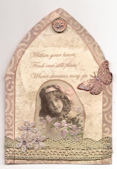
Gothic Arch Within the Heart

Gothic Arch Within the Heart

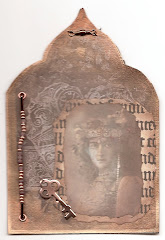
Gothic Arch, the Key

Gothic Arch, the Key