Tuesday, 1 October 2013

Autumnal Altered Book

Hello everyone and lovely to have you drop by here. Today is the first of the month and that means challenge time over on the Artistic Stamper. The theme this month is Alter Something. I decided to alter a book and make it into an Autumnal decorative piece
This was a fun project to do and I will put a quick step by step here. I saw the idea of this ages ago on Pinterest, but then I gave it my own twist.
Start with any old book you can pick up at a charity shop. A hard back book will make the project more sturdy. Fold all of the pages in half, about three or four at the time, until it looks like this:

I covered the covers with Gesso and then edged everything with a dark brown paint dauber. As you won't really see the covers I could have left that bit out really...

Next I inked the edges of the pages with gathered twigs Distress Ink and then created two background panels. As I wanted my project to have autumnal colours I used Distress Stains in Wild Honey and Rusty Hinge on pre-wetted water colour papers. I splatted the stains around, added more water to mix them well and added a handful of coarse kitchen salt for added texture. Once the papers have dried you wipe that off and are then left with a wonderful pattern.
I inked around the edges with some Aged Mahogany Distress ink, to deepen the colour a bit more.
I then used these cool stamp sets by Katie Fox available from the Artistic Stamper.

 And also this Chevron Stamp
Here are some close up photos so you can see more or less what I did:
I ran the top panel through a Tim Holtz texture fade, stamped my chosen stamps in one of the new Wendy Vecchi Archival Inks, Potting Soil, I also used an Artistic Stamper Script Stamp and one of the Chevrons in Red Geranium Archival. I covered the top panel of the book in some printed tissue paper first.
Then I glued my stamped panel on top. I curled the edges a bit an stuck some bits and pieces underneath for a bit of added interest:

The bottom panel was done in a similar way:
The bit on the bottom is a bit of chip board painted in brown acrylic paint and then embossed with some gold embossing powder. I love how the leaves when you stamp them and then cut them out look so realistic.

I adhered a piece of lace underneath the panels to hold the book open at an angle and then decorated the top with some die cut sprays and leaves and flowers. The flowers are from Wild Orchid Crafts and the leaves were cut with the Tim Holtz Autumn Gatherings strip die.

Well, hope you like this, it's great fun to do and of course you can do it in any style you want. I may well do a Christmas themed one for my Christmas table and I think a Spring one with butterflies and pastel colours would look lovely too.
Thank you for visiting today and you have a whole month to play in the Artistic Stampers challenge where one lucky winner will win a fab stamp set of their choice!

Monday, 30 September 2013

Go confidently in the direction of your dreams

Hello everyone and thank you for dropping by here. Today I am sharing my penultimate project for Snazzys where it is my turn this week.. It was a great ride but time to move on..... Anyway, if you want to see the details, please click HERE

Thanks for dropping by here today

Friday, 27 September 2013

Autumn Gift Set

Hello everyone, welcome and lovely to see you here. Can you believe it is nearly the end of the month?
It is my turn to create a project for Spellbinders as one for their international Blog Ambassadors.
I decided to create a gift set, a card and a box, featuring their wonderful 3D M-Bossabilities. If you don't know these yet, you are in for a treat, you have never seen anything like it. The embossed impression with these folders, truly is 3D!
The folders I used were:
Rustic Wreath and Persian Splendor
I also used a number of dies:
Font One Upper Case
Orchard Harvest Tags and Accents
Ribbon Banners
Blossoms Five
Splendid Circles
Here is a quick step by step of how I put it all together, lets start with the card:
I cut a piece of 5 x 7 smooth white card stock, put it in the Rustic Wreath folder and ran it through the Grand Calibur using the Pink and the Raspberry Plates. This folder is actually a Christmas one, but by using Autumnal colours the wreath was easily transformed. Here you can see how I coloured it with Distress Inks: Wild Honey, Peeled Paint, Crushed Olive, a tiny bit of Pine Needles, Rusty Hinge, Aged Mahogany and finally Gathered Twigs.
A lot of colours, but I love how the blending of them just brings out the embossing. Here is a close up of the wreath:
I coloured the berries with a bit of Treasure Gold Renaissance Gold.
Next I stamped by sentiment and then cut and embossed it with the number 3 (3rd smallest) of the Splendid Circles dies.
As you can see, I added a bit of string and a brad.
I also stamped a greeting (Tim Holtz Simple Sayings) and cut and embossed it with one of the Ribbon Banner dies, these dies fit the Tim Holtz sayings just perfectly.

For further decoration of my card I stamped a few leaves (Artistic Stamper), cut them out by hand and coloured them to match the rest of my card
I made a flower, using the Blossoms 5 die and then matted and layered it all up with some other little leaves from the Orchard Harvest set and a few bits and pieces from my stash


The box was done in a very similar way. I made a 5 x 7" sized box out of Kraftcard and then  I embossed a piece of 5 x 7 card, this time with the Persian Splendour folder, This made the topper of the box. I then cut and embossed 2 further pieces which I trimmed to fit on the sides of the box, colouring everything with the same colours.

As you can see I cut and embossed the word Art with the Alphabet dies (love these, the fact you can emboss them really makes them pop), and then embellished in a similar way.
And finally the completed project:

Well, hope you like it, thank you for visiting and happy October when it comes to you all. Can't wait to show you some Halloween projects soon.

Thursday, 26 September 2013

Faded Glory

Hello everyone and thanks for dropping by.
My turn today to show a project over on the Artistic Stamper blog
To see the full project, all you need to do is click HERE
Thanks for dropping by again and see you over there hopefully....


Wednesday, 25 September 2013

Fly Free altered canvas

Happy Wednesday everyone and lovely to see you here. Today I am sharing a little canvas with you, created for Sin City Stamps

Today will be the last time for a while that I will be featuring these two beautiful stamp sets:
I started with a little 6 x 6" canvas and covered it with random strips of paper

Next I painted it with two colours of acrylic paint, I used Distress Paints in Salty Ocean and Chipped Sapphire.
Then I knocked the colour back a bit by going over it with white acrylic paint mixed with Golden brand glazing liquid.
As you can see, I also added a bit more interest by painting some colour back through a couple of stencils, I used two of the new Tim Holtz tag stencils. I also did some background stamping with the journaling stamps and some white paint.

Now for the vocal image, - I created a background with Squeezed Lemonade, Salty Ocean and Chipped Sapphire Distress Inks and Stamped the largest of the Butterflies in Cobalt Blue Archival ink and then I cut it out.
Time to put it all together: I added a filigree piece and flower to the centre of the butterfly, die cut some letters (I used the new Spellbinders ones) to spell Fly Free. I then added some more background stamping with Cobalt Archival straight onto the canvas. I added a piece of butterfly trim and positioned it all on the canvas until I was happy with the composition.


The final touch was to add a bit of shading with a black charcoal pencil to make the letters pop a bit more.

Before I sign off: on the 12th of October we will have a fabulous blog hop, make sure you don't miss it!! There will be an awesome prize!!!


Well, hope you like my project, quick, easy and fun to do. Thank you for visiting and see you next time!

Monday, 23 September 2013

Playing with Pastels (no not Pan...)

Hello everyone and thank you for dropping in here today.

Recently I have been much inspired by the beautiful work of Maria from Maria's Knutsel Plezier. She makes the most amazing backgrounds but just in the last few days has been playing with Pan Pastels.
Well that gave me the inspiration to try something just a little different:


Now to be really honest, I am not a huge fan of Pan Pastels I only have very few colours, but I loved what Maria did with them, so I started to experiment with something else. I have a small set of  Faber Castell Polychromo Pastels which I use occasionally for my other art work (that I don't blog here). I love these pastels, there is nothing quite like them. They blend like nothing else I have come across, just using your finger in a piece of cotton fabric (I use cheesecloth)
This is what the pastels look like:

You rub them onto your finger (inside the cheesecloth) and then start to blend in a circular motion onto your paper. I used smooth stamping card but they work brilliantly on water colour paper too. Oh and just in case you are wondering , - no I am not on Faber Castell's Design Team or anything (wished I was), I just love these pastels lol
For this one I blended my two blues, a tiny bit of the pinky red and the orangy yellow. Around the edges though I used a Pan Pastel brown. The Pan is much more powdery and "solid" in colour and you have to use it very lightly for this technique. Next I stamped the poppies and grasses (Chocolate Baroque) in embossing ink and then rubbed my pastels over it again. I coloured the image with Distress Markers and my water brush. I then masked it, stamped a Darkroom Door script stamp in random places and added a swirl stamp from Stempel Glede around the edges. Then I rubbed over it again with my pastels to bring out the detail.
For the next one I first ran my piece of card through a little snow flake embossing folder (a freebie that came with a magazine some years ago). I then used exactly the same technique but just the two blues and a tiny bit of brown again. The stamps are from Crafty Secrets and then the same script and swirl stamps.


I rubbed a tiny bit of Treasure Gold in Pewter over the snow flakes. I just love how the colours are so translucent and subtle. Very, very different from blending Distress Inks for instance. I'll try and show you the difference in the last one:
The main stamp is from Chapel Road Art Stamps and this time I used all of my colours. The apple sentiment however was done with Distress Inks, stamped in Potting Soil Archival, cut out and then adhered to the card.
You can no doubt see that the intensity of colour is very, very different. Don't get me wrong, I love my Distress Inks, it just all depends what effect you want to achieve.

Well hope you like my little exploration with pastels here and thank you for visiting!!

Related Posts Plugin for WordPress, Blogger...

One World One Heart

Photo

FEEDJIT Live Traffic Feed

Birthday Card

Birthday Card
Just got a whole lot of new stamps from a brilliant place called the Stamp Smith. This is the image that I first saw on Docraft and really liked. I asked the friend who has used it in an ATC, where she got it. Well she borrowed it from a friend who got it from ebay as a one off. But.... it had a title. I googled the title, and hey presto found the site. They have great stamps and offer a really friendly fast service. I highly recommend them!

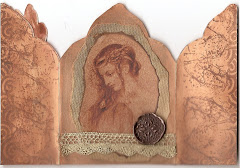
Gothic Arch Trifold inside

Gothic Arch Trifold inside

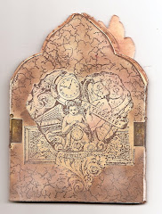
Back of Gothic Arch Trifold

Back of Gothic Arch Trifold

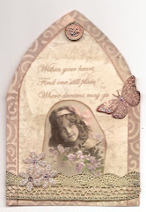
Gothic Arch Within the Heart

Gothic Arch Within the Heart

Gothic Arch, the Key

Gothic Arch, the Key