It's Friday (and yes I know it's the 13th, but really I am not superstitious), so I am happy on this lovely Friday to show the first of two projects I am sharing today. To see my project for the Artistic Stamper, just click here .
This project I made for our latest challenge over at A Vintage Journey
The theme the lovely S@ndy has chosen is Wings and Things. You can read all the details HERE
As you may know by now, our challenge is sponsored by Countryview Crafts and there is a wonderful prize up for grabs, so we hope you'll play along. Who does not love all those wonderful winged creatures, and there are plenty of Tim Holtz products that will suite the theme.
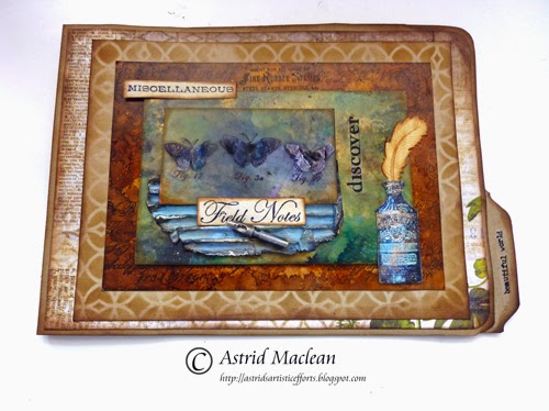
I decided I wanted to make a file folder album and plan to use it for future Tim inspired projects. For this challenge I made the cover.
I'll list all the products I used at the bottom of this post.
I started by making the central panel by layering two different pieces of........ you'll never guess: Tim Holtz packaging. My team mate Jenny from Pushing the Right Buttons has done a brilliant tutorial on how to make these really cool backgrounds, you can find the details here. I am the lucky owner of the card she used for this tutorial and fell in love with the technique. I made a brown and a greenish panel and played a bit further still with the technique with also adding some Espresso and Gold Mixative alcohol inks. I forgot to take step by step photos, so can only show you small corners of it:
The brown panel, over stamped with the lovely script stamp from the Mercantile set.
The green panel, in real life it has some lovely gold flecks.
The central bit was an extra strip. I stamped the 3 butterflies from the new Classics 17 set in black archival. I then used a bit of clear packaging and stamped the butterflies again. I cut out just the wings, heated them with my heat gun to shape them a bit and then glued them onto the original stamped butterflies. This packaging is not all that much different from Clearly For Art I don't think, and I love recycling, and let's face it, who does not love to save a few pennies.... I am sorry though that the photo is so bad, but the light kept reflecting off the wings...I tucked another bit of recycled corrugated card coloured with Tumbled Glass Distress paint, Coffee Archival and Treasure Gold underneath and added the Field Notes from the Classics 17 set plus a pen nib.
Next came the bottle from the Mercantile set. I coloured a piece of Specialty Stamping paper using some more of the Distress paint and also inked with Leaf Green archival. Stamped the bottle with Black Archival and then fussy cut it.
The Feather is from a Spellbinder die set.
The word Miscellaneous from the Mercantile set finishes it all off.
I adhered the panels with foam tape and then mounted it on a file folder, cut in half and covered with a piece of paper from the Wallflower paper stash
Well, I hope you'll like it and will decide to play in our challenge. Do hop over to A Vintage Journey if you have not been yet, to see the amazing projects my teamies have created and if you decide to play along, don't forget to check out the traveling instructions!!
Thanks so much for visiting and see you next time!



26 comments:
Astrid - your folder is fantastic.
Just love all the details and how you have combined the beautiful colors. Thanks for participating
as we travel down the vintage road.
As always another beautiful piece Astrid. I just love how you use the colour blue. Thanks for sharing your talent. Karen.x
you truly are the queen of color and depth , loveeeeeeeeeeeee x
Gosh, Astrid! I love the techniques you've used!! I love the idea of using the packaging and it's nice to know that you can shape it with heat! This project is really fantastic!
Thank you for your lovely comments about my SOC tag. I had a great time making it.
Such an amazing effect you have created on this Astrid. I thought at first it was tray. Such beautiful designs.
Love Chrissie x
I extra, extra like this one...if that's possible! Beautiful colours, texture and depth Astrid, you are very inspirational. Thank you Ruth x
Such inspiration in your posts, always learn about mixing colours and more. Your file folder is glorious! :-) xxx
Oh my goodness this is so beautiful as usual Astrid. I say like Ruth here, if that´s possible, I´m really out of new words to describe how much I love your work, it´s just sooo beautiful, even I almost feel like a taperecorder repeating myself every time LOL:
Have a wonderful week-end ahead now.
As always Astrid, you have created a mini masterpiece, this one is absolutely stunning too. I love the colours, the distressing, the texture - well - everything really. Beautiful work! Hugs, Anne x
Such fabulous detailing on your folder Astrid and the background from the packaging is just amazing. Beautiful colours and so much texture. Have a lovely weekend. Jennie x
This is gorgeous Astrid, a real work of art. Fabulous composition - love the elements you've used. Chris xxx
this is fabulous astrid - amazing texture - love the feather - brilliant xx
another amazing make of you Astrid..
I love all about it.. it's filled with so much love and knowledge..GORGEOUS!
your art speaks to me in a very special way..
thank you for sharing!
happy weekend!
Absolutely beautiful... those inky packaging layers are wonderful, as are the dimensional wings on your little butterflies (definitely a recycler here too... works perfectly well with a heat tool!). Another lovely creation... Hadn't clocked it was Friday 13th - not generally superstitious, but it was also a full moon last night, which I find does make a difference!
Alison xx
LOVE the inky layers Astrid. So pleased you gave the altered packaging a go with such stunning results (thank you for the shout out too :) and each layer would be outstanding on their own. Working together they create a superb depth and dimension, just perfect for your butterflies and robust enough for the cover. I bet you'll be reaching for it regularly just to look at it. Jenny x
Stunning design and artwork, love it very much. Happy Weekend, Shirleyx
How gorgeous ,
the background paper is fantastic in its rusty tones, and those butterflyes with the extra wings recycled from packaging paper is wonderful, and even more in real life I`m sure !
Your colours sparcle and are so beautiful dear Astrid.
Hugs,Dorthe
A stunning project, gorgeous textures and effects.
Yvonne
Beautiful as always - so Astrid - can recognise your style a mile off! Nikki xxx
I did not realize Spellbinders even had feathers!!!! Astrid, again you have wowed these eyes with beauty! Clever idea to make a file folder album and the cover is gorgeous! Have a lovely weekend, Hugs!
Astrid this folder is DELIGHTFUL and very fun... Love the colors and the butterflies are so pretty... off to flying... Love, Light and Peace...Bonnie
Beautiful love yout posts and projects, sooo inspirational Thank you for sharing :)
An amazing project with fantastic details. Thanks for all the close ups.
what a lovely folder cover Astrid! I love how you colored the packaging pieces - and will check out Jenny's post on it as well which I did not see - the corrugated card board is so pretty in the blue!
Fabulous layers Astrid...first glance I thought it was framed as the layers created depth. I adore the textures and the wonderful layout of the stamps and dies
Huge hugs Annie x
Gosh you have been so busy since my last visit to your blog. Love all your ink techniques on this and the corrugated card. Amazing work.
Julie x
Post a Comment