Welcome everyone and lovely to see you here today!
I don't know about you, but I have always loved to use paints in my projects, mainly for backgrounds of course. The two kind of paints that seem to be talked about most in blogland, at least the corner of it where I tend to visit, are Tim Holtz Distress Paints and Paper Artsy Fresco paints. Now I do have a rather small collection of the Fresco paints, a slightly larger collection of the Distress Paints, but the colours that I use most often and have by far the widest range of, are Golden Fluid Acrylics. Today I felt like messing about with paints and so I thought I would put all of them to the test to see which ones I liked best.
Now I could write a long resume of the outcome of my musings, but I doubt you would want to read it all, most of us are busy and there are a lot of blogs to visit. So I'll try and keep this brief:
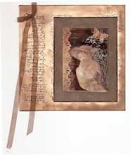
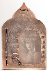
Paper Artsy Frescos: Love their chalkyness and the depth of colour you can reach by layering first the opaque and then the semi translucent and translucent ones over the top. I have 9 different colours in total and I used 8 of them to make the background to this piece
Tim Holtz Distress Paints: Love the ease of application, and blendability and I was amazed how I could use them to add a few highlights to my background, even though they are so translucent, they stayed on the surface of the chalky Frescos somehow.
Golden Fluid Acrylics: Their purity of colour and high pigmentation are unbeatable, most likely they will always be my paint of choice, though I did hardly use them in this piece.
So the outcome: Well I love them all and found they work pretty well together too!
So here are a few close ups of my piece still:
Before starting on my painted background I had added some texture paste to my board and stamped into it with various detailed stamps slightly wetted with water.
The flower was created with a Paper Artsy Stamp (Hot Pick 1004), stamped twice, cut out by hand (I don't have the matching die), shaped and layered. The centre is a Wild Orchid Crafts flower.
The butterfly is a Spellbinders die, painted with a mix of paints and high lighted with Treasure Gold in various colours.
Stamps were Tim Holtz and Prima, stamped with Stazon and Fresco Paints.
Well there you have it, a little exploration into paints. Hope I haven't bored you too much. Of course many of you, specially Andy Skinner fans, will have Decoarts paints too. I don't have any of them, so I can't tell you anything about them, but I know some people swear by them.....
Hope you like my little board, thank you for visiting and hopefully see you soon again!


42 comments:
Love the way you've mixed the paints and tested them. One question Astrid, I don't know what the 'light fastness' is for each make of paint. Do you know by chance? Many thanks for yet more inspiration. Hugs, Jenny x
I love your board, Astrid, the colours are amazing
Rosie x
Fabulous colours and I love all the textures. Your mixed media projects are just wonderful and even nicer in real life.
Crafty hugs
Annie x
WOW Astrid. What a stunning piece of Art. I have saved what you have written about the inks and maybe it will be of help to me in my new journey in mixed media. Enjoy your weekend. Hugs Rita xxx
Absolutely stunning Astrid. I found your thoughts very interesting
A fabulous piece of art Astrid, but lovely to know how the different paints work and what you like the best. I will have to invest in more paints this coming season (i only have four Distress) and have been looking at all the options, so thank you. I love the way you mix the different products x
Great piece - appreciate the review.
Hello Astrid
You did not bore me and I knew before I finished reading your post what your opinion was going to be on these different paints, I have to agree with you in your summation; fluid acrylics are my favourite to work with also, but they do not suit every project, so that is where the other makes come into the mix, all types I believe have a place in the Artist's room, that is why it is mixed media and we love it so, the effects are always surprising.
And as far as your project is concerned; it is just beautiful and you always inspire.
Smiles:)
Sue
Amo seu trabalho. Ficou espetacular, maravilhoso.
Beijo, feliz semana.
I love your piece! Great colors and textures. Since I'm just learning about paint and basically exploring what can/can't be done I found your post very interesting. Thank you for sharing thoughts on paints. Hugs
Like you Astrid I have a range of paints and got into acrylics some years ago having used oils at college. I now own some of each of the fresco and distress and Decoart paints as well as odd acrylics but never tried the go,den fluid ones. Thanks for taking us through your musings and sharing your thoughts and for the wonderful artistic piece you made. It has some beautiful shades of colour and amazing textures.
hugs {brenda} x0x
Hi Astrid well first of all this is a gorgeous project, your painty background is stunning and almost seems to glow. Thanks for the review of the paints, I don't have any Golden acrylics but I think i'll have to try them. I love the distress paint but don't like the bottle, I always get in such a mess with them lol
Claire xx
Just love all your fabulous colours and great textures...just love the way you play with your paints and get a great end result
Anne
Wonderful piece of art with fabulous colours and textures. Thank you for the revue of the different paints.
lOVE cHRISSIE X
I have to admit, I´ve never been very good at using paint at all in my work, even thoug I absolutely love how it looks, when others have made them, but for some reason I just never seems to be able to get anything to look just near how all of your works looks, and when I´ve tryed a few ties, I always end up throwing it in the bin in the end, becaue I´m never happy with the outscome. The paint just never reacts, like I want it to do LOL. But I sure wish, I could make some masterpieces like you are creating all the time. This one looks amazing and really beautiful too, like everything you ever do.
Thanks sooo much for the lesson here, maybe if I try some of the same paints, I´ll get a better result too someday. A girl can dream, can´t she? ha ha ha
Have a wonderful sunday and fill it with fun.
Stunning piece of work with lots of texture and vibrant colours. Interesting to read your views on the various paints - thanks for sharing.
I love the warm colours you have used. And it was interesting to read about the way you think about your paints you have.I realy like your texturein combination with the flower.
Anneke.
It is never boring reading through your posts Astrid, they are always enlightening, just as this one is. I really must get some Golden paints, I want to try them now! Love your beautiful board, it is gorgeous! Hugs, Anne x
Not boring at all Astrid but very enlightening.
Being a newbie to all the paints and still not using them as much as I should it was very helpful.
Love your artistic piece as usual.
Crafty hugs from Shirl x x
This is lovely ... It never occurred to me that I could stamp into textured paste ... Thanks for pointing that out ... great when you don't have stencils ... Have a lovely sunday!
WOW what a sensational art work. LOve the awesome coloring and the textured effects. Really a little masterpiece beautiful as always!
Have a nice sunday,
hugs Anja
Maybe more important as the brand is, if you know how to use the paint and you did perfectly (:o)Your colour arrangement is stunning even the stamping into texture past, i still have to exercise.
Dear Astrid, you have created quite fantastic artwork during my absence. I could learn a lot from you.
My daughter and I spent a week in London. It was already the 5th time that I visit this fascinating city. We had a lot of fun and have discovered much news. I wish you a nice rest of the weekend, my friend.
Hugs MARTINA
I love your piece, Astrid. And, thank you for reviewing the different paints. I don't have any of the Fresco paints but they sound interesting. Thanks for sharing your thoughts and for you beautiful work!
Hi Astrid, As a 'newbie' to paints I found your review very helpful as I wasn't sure about mixing them on the same project, thanks.
You've created a wonderful board, love the depth and choice of colours and textures.
Avril xx
Astrid here I am to catch-up with your creations.
This piece actually seems to glow, the use of colour is so skilled and also the texture. This is incredibly impressive.
I love Fresco although I only use a limited colour palette but for me they give me that chalky texture which I've used since I started stamping except there were no Fresco paints then so I would head to B&Q for heritage emulsion paint, which I still use to this day.
Distress Paints I don't own but have considered them, especially Antique Linen, Tattered Rose or Victorian Velvet.
Your thoughts were appreciated.
Wishes
Lynne
P.S. Thank you for your lovely comment on my DT post today. For you to say that my pieces look like genuine ephemera, well that has made me incredibly happy.
So glad you decided to play around with paints again. This is awesome, I love the texture!!!
This is a stunning piece of art. Great colours and textures. So very very lovely!!!
xxx Marianne
Exquisite!
Fabulous!
I too LOVE paints...too much! Love what you've done here! The background color and layers of texture are sublime!
This piece is super gorgeous Astrid. Love the blending of colours and the beautiful textures. Love the stamping too and the flower is fabulous!! This post is definitely not boring ... I don't believe you would know how ... I was very interested in your opinion of those paints. I don't have any of these as yet but when I'm ready to try my hand at mixed media I will definitely be referring back to this. Thank you so much for sharing it. oxox
Astrid, dear friend, this amazing board is a joy in "shiny" colours and bright sunny feelings.
I`m not much of a painter in what I do, and would love to learn more! Seing your gorgeous piece with so many colours mixed wonderfully together, and the stamping into the paste giving them even more life, tells me I have so very much to learn. Your handmade flower is totally beautiful, too.
Hugs from a sunny day on Bornholm, and from me.
A dream!!!!!
never boring, I love your posts and works, you are inspiring and the lightness and purity of colour in this piece is beautiful. really appreciate reviews, there is just so much stuff out there. thanks.
Such amazing depth and clarity to the paint colours and, as many have said already, a real glow too. Jeepers - Golden Fluid Acrylics, eh? I have many Frescos, a goodly number of DPs, and yes, some DecoArt too - so I may just have to hold off on the Golden ones for now (though I love their gel medium so...). Gorgeous make.
Alison x
Gorgeous mixed media! I love the textures!
Ooowww this is exciting already, I have neither of those paints so it will be great to read what you thought,,,,,, GREAT, you like them all, shesh, have to get all of them LOL,I do have a few goldens and use them sparingly. The magic you created all over this, you can create in any medium and create gorgeous pieces of work, this visit has been mind blowing, soooo much creativity, thanks again my dear...
Oh forgot to say koodoos for you for cutting the flowers, I have to cut too:O)..
Hello Astrid
i hope you are well
thank you for commenting on my blog while I was away and for your wishes for my happiness.
I did comment on this just as the internet went down and I see it did not post! Glad I did my blog up front before I went away!!
This is lovely the colours, everything and well done for cutting the beautiful flower so perfectly it is lovely and I love the butterfly too!
Crafty Hugs
Heather xx
Gorgeous, gorgeous work!
~Linda
Absolutely gorgeous! Love your rich colors and thanks for the breakdown on the paints, too.
Post a Comment