Sunday, 12 June 2016

Altering Papers a step by step for "beginners"

Hello lovely visitors and welcome to you all. I am sharing the first double page of another little book with you today:
After the last little book I did I was approached by several people whether I could describe in more detail how I go about altering the papers I used for that one. I know many of you will be quite familiar with how to do that, but for those who are just in the beginning of your crafting journey, - here is a step by step on one way of how you can do this.
I start by choosing papers that are roughly in the colour tones of the scheme I have in mind already. I wanted this booklet to be quite grungy and vintage of course, so the Indigoblu Belle Epoque Mixed Media card stack was perfect for this. I used the 6 x 6 size and this is one of the papers and my very first step was to cover each paper with a coat of clear gesso. This adds tooth and seals the papers which are quite glossy..
I then covered the central part with heavy gesso and while still wet dabbed my finger in it to create a stucco like texture.
To make it slightly less stark I then added some Titan Buff acrylic paint, I used the Golden brand here but you could use Decoart Media Fluid acrylics or Distress Paint in Antique Linen or indeed any other brand you may have. Blend it out with a baby wipe, to avoid hard edges.
Next add a few spritzes of a spray ink. I used Distress Stain Spray in Weathered Wood, but again, use what you have on hand. Using a spray adds depth and interest and will highlight textures, but have a baby wipe on hand to mop up any unwanted areas.
Next I added some stenciling along the edges, using a mix of Archival ink in Sepia and Distress Ink in Rusty Hinge. I also did some background stamping, again using Sepia Archival ink. The stamp I used is a Tim Holtz one from the Curiosities collection.
Next I wanted to add some imagery back in. I usually do this either with stamps or sometimes with the top layer of a paper napkin. In this case I used some scraps of rice paper.I adhered them with mat gel medium that makes them almost translucent. I purchased  the rice paper (as well as many others) on ebay HERE. This lady has the best selection I have been able to find!
Time to create some embellishments. This could be anything of course. In this case I stamped and die cut some elements from a Heartfelt Creations collection. I used a previously coloured bit of a manilla tag. After taking this photo I coloured the grapes still with a coloured pencil.
I decided to stamp and fussy-cut a butterfly as a companion piece to the butterfly that was already on the paper. I coloured it with the same colour inks I had used before, Rusty Hinge and Sepia Archival and also added a touch of Paper Artsy metallic glaze for a little shimmer.
And here you can see how it all fitted onto the page. The final step was to add a quote. On this occasion I used a quote from a Cloud 9 collection of clear quote stickers that I have had in my stash forever, but I found you can purchase them HERE . Oh and I also added some stamping around the edge, this is a Limor Webber stamp produced by Indigoblu.
The page on the other side was done in a very similar way. I just added some texture paste through a stencil still and some strips of fabric for texture,  and obviously used some different embellishments.
Here is a close up of the embellishments still so you can see them a bit better.

Well, I hope this was useful for some of you. There are several more pages to follow still but I will keep those for another day. Have fun crafting and above all enjoy what you are doing. You never stop learning!!

Thanks for your visit like always

Friday, 10 June 2016

Our House for Paper Artsy

Hello everyone and thanks for coming by. Tonight I am excited to share a project over on the Paper Artsy Blog, where the theme at the moment is "Our House".
I chose to take quite a free interpretation and created a journal page incorporating words that express how I feel about my home that I love.

Here is just a little peek, the full project and process steps can be found on the Paper Artsy Blog


While working on the page for Paper Artsy, I created a second spread too, using the same sets of stamps, Ink and the Dog ID 09 and Eclectica ESN 18. I used very similar techniques for this one,but I like the one on the PA blog a little better, 
 I would like to thank Darcy and Leandra for inviting me to post on their blog, it was an honour to do so. Hope you'll take the time to hop over and have a great weekend when it comes!

Tuesday, 7 June 2016

Mini book final part - the tags

Hello lovely visitors. Today I am sharing the final part of the little book I made. If you missed the other parts you can find them here and here
The little book has two pockets, just the right size for a #8 tag.
I made them in a similar style to the little book itself and chose the colours so that they would match the pages adjoining the pockets.
I used Pion Design papers that had been gathering dust in my stash and then altered them with Distress Inks, stamps, an embossing folder and in the case of this one, some lace.
I decided to stick with my flowers and butterflies theme. This little butterfly was fussy cut from another paper of the same collection.
Using the same background stamps and similar colour scheme throughout a project help to tie it all tog
gether I find.
Another fussy-cut butterfly from the same collection, but this time coloured a bit with Distress Ink (Scattered Straw)
Below are still a couple of photos of the tags together with the pages they belong too.

Well, that's it for today. I am working on another little book right now. Both are gifts for crafty friends I am going to meet up with in a few week time.

Have a wonderful week everyone and thanks for your visit!

Sunday, 5 June 2016

Minibook cover for Shimmerz (little book part 2)

Hello lovely visitors, hope you are happy, healthy and well.

Today at last I can show you the cover of the mini I posted here recently. To see how it turned out, please head over to the Shimmerz blog. Here I am showing just a little snippet of it.....
If you missed the little book itself, you can find it HERE. The tags that fit inside the pockets I will share with you in a few days time.

Happy week to you all and thank you for your visit like always.
xxx

Friday, 3 June 2016

Texture or embossing paste, - a canvas for A Vintage Journey

Hello everyone and welcome. Today sees the start of our June challenge over on A Vintage Journey and I am the host this month. The theme is simple, use some embossing or texture paste in your project. You can find all the details at A Vintage Journey.
I chose to use a wooden canvas board as my substrate, so that I could layer a variety of paste and play with textures, without the danger of it warping. Below is a description of how I went about it:
I started by covering my board with a thick layer of gesso, scraped on with a palette knife. I then added three different texture pastes: Stamperia Fresco paste, a really thick stucco like paste. I have had it in my stash for ages and it was really thick, which made it very easy to stamp into as you can see at the bottom left and the top right. I also used some Prima Sand paste and some  Decoart crackle paste. Below a close up, the sand paste will start to bubble when you heat it with a heat gun.
Of course it is important to also remember the sides...


Next I gave it all a first layer of colour. I used a mix of paints, Paper Artsy Fresco, Distress paints, crayons and some sprays and played around until I was happy with the result.

As you may have noticed, I also decided to add some more texture through a stencil, I used Grunge Paste for that.
Some more colour and some Decoart Antiquing cream was added to bring out the cracks and textures further.
I also added some background stamping, using a dark brown Faber Castell Big Brush Pen to ink up my stamps
Time for the finishing touches. I had seen this wonderful Tattered Poinsettia flower on Pinterest and wanted to create something similar.
I took a piece of scrapbook paper and stamped the big text stamp from Tim's Papillon set in Cobalt Blue Archival and then cut it with the Tattered Poinsettia die.
I deepened the colour with Distress inks and added some glitter here and there.
And here is the finished flowers, as they say, Poinsettias don't need to be just for Christmas....
The focal point of my piece became this stamp from La Blanche, I stamped it in black Archival on a piece of scrap paper. The other time pieces were fussy cut from a piece of Prima paper and glued behind.
And here is the finished piece. The sentiment was cut from the same paper that the bee was stamped on, an old Prima line.
And here finally a side view still.
Well that's it from me, if you have not been already, please hop over to A Vintage Journey to see all the amazing inspiration my teamies have created and of course we would all love you to join in our challenge!!
Thanks for visiting here like always and have a creative weekend!!

Wednesday, 1 June 2016

Get texty - a journal page for Mixed Media Monthly

Hello everyone, welcome and Happy June!! The first of the month means a new challenge at Mixed Media Monthly and this month I am sharing a journal page with you.
But before I show you how I put this together, let me tell you what our awesome theme is this month:
It's our second anniversary this month and like last year, you can choose any theme from the past year, so plenty of choice to get creative!
I chose our theme from #15 get texty, and here is the badge for that theme:
Like always we have a sponsor and this month it is no other than The Funkie Junkie!! Our winner will win a fabulous $25 gift voucher, how lucky is that? And what's more, there will be other random prizes during the month, all generously donated by The Funkie Junkie Boutique,
 so make sure to keep checking back regularly!!
Anyway, on to my project.
I created a quick background by mixing some brusho powders with gel medium and brushing them all over my background. I then added some messy stamping and stencilling with water, which left white marks here and there as the stamps were a little too wet.
I wasn't too fond of the effect so toned it all down with some light coloured acrylic paint
As I had chosen "Get Texty" as my theme, I adhered some Tim Holtz Tissue Wrap and various tissue and washi tapes that contained text and adhered them down with Tim Holtz Vintage Collage Medium to blend them into the background.
I created a little pocket envelope and other vintage looking paper embellishment using some scraps of designer paper and a variety of stamps.
I positioned them onto my pages and added a little vintage image as a focal point. Some strips of old book paper, a bit of stencilling, a sentiment created with letter stickers and a pen nib finished it all off.
Below are some detailed photos still:


Lots of different texty elements as I hope you can see...
Well that's it, I had great fun putting this vintage double page together, hope you liked it and of course we all hope you will play along with our challenge, with so many different themes to choose from, there should be something for everyone.

Thanks so much for dropping by here, like always you can get all the details of our challenge over on the Mixed Media Monthly Challenge Blog. Hope to see you there and have a great month!!

Related Posts Plugin for WordPress, Blogger...

One World One Heart

Photo

FEEDJIT Live Traffic Feed

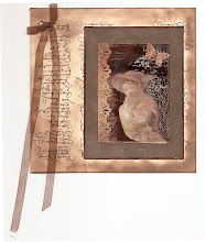
Birthday Card

Birthday Card
Just got a whole lot of new stamps from a brilliant place called the Stamp Smith. This is the image that I first saw on Docraft and really liked. I asked the friend who has used it in an ATC, where she got it. Well she borrowed it from a friend who got it from ebay as a one off. But.... it had a title. I googled the title, and hey presto found the site. They have great stamps and offer a really friendly fast service. I highly recommend them!

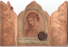
Gothic Arch Trifold inside

Gothic Arch Trifold inside

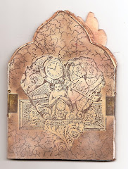
Back of Gothic Arch Trifold

Back of Gothic Arch Trifold

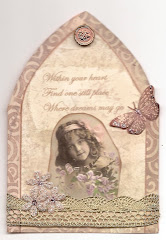
Gothic Arch Within the Heart

Gothic Arch Within the Heart

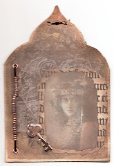
Gothic Arch, the Key

Gothic Arch, the Key