Hi everyone, lovely to have you drop by. Sharing my tag for May inspired by the one and only Tim Holtz.... As most of you will know, you can see Tim's example by clicking HERE
Now where as the April tag was probably my favourite for this year so far, I did not like the May one very much to be honest. So I can't say I was hugely inspired when making this and I know it rather shows. I like mine even a whole lot less than Tim's!!! Still, I was determined to make each of the 12 tags this year, so here is my May tag, warts and all.
I followed Tim's method pretty much exactly, I even used the Wallflower paper, but my background is much darker, which I now think was a big mistake. I also did not have the same embellishments as he has, so I used what I had and then mounted my small tag on a larger one as I have done for my other ones. Here are some close ups:
I used the word Fabulous for my Shadow Press tile, - mistake number one, - the background is far too busy....
This tile I quite like, but it looks awful against that dark background.... That's the real problem with all the other tiles too, apart from the fact that I think it all looks far too blocky.
I did what Tim did, I made little tiles from chipboard, glued on my chosen bits of paper and then sanded around the edges. For some reason I left the edges white rather than inking them and that is the one bit I am quite happy with.
Here you can see a bit of the size 10 tag I mounted the other one on, for each of my tags I always add the month at the top.
Do you ever have projects you make and then really don't like? Well, I do, and this is one of them, but I decided to blog it after all and I did not want to start all over again, so I'll just live with it....
Hope you'll enjoy your tag better than I did, mine actually looks a little better in real life
Have a good week and hope you get some creative time, thank you for taking the time to visit!
Subscribe to:
Post Comments (Atom)
FEEDJIT Live Traffic Feed
Birthday Card
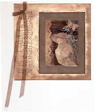
Just got a whole lot of new stamps from a brilliant place called the Stamp Smith. This is the image that I first saw on Docraft and really liked. I asked the friend who has used it in an ATC, where she got it. Well she borrowed it from a friend who got it from ebay as a one off. But.... it had a title. I googled the title, and hey presto found the site. They have great stamps and offer a really friendly fast service. I highly recommend them!
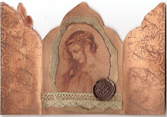
Gothic Arch Trifold inside
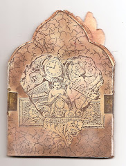
Back of Gothic Arch Trifold
Gothic Arch Within the Heart
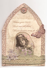
Gothic Arch, the Key


39 comments:
Hello Astrid,
I think you are far to critical about how you made this Tag.
Yes it is blocky but that is the design, yes you could have used a lighter Bg, but this looks very masculine and not too awful. but I know how you feel and if you don't like it then you simply don't like it! I will not convince you otherwise.
It is a relief to know you are human.
It is not that dreadful a Tag.
Smiles:)
Sue
I struggled with this one too. I could not get my embellishments to fit on the #8 tag. My colors were funky, but after playing and shifting bits and pieces around it came together(on a #10 tag). Bravo on posting something you didn't really care for. It takes guts to do that! I still think it rocks.
Jess
Your tag looks great like always Astrid , I love all those beautiful men elements , the colours and the image , nothing wrong at all!!!
Greetings
Maria
Good Morning Astrid. Your tag looks fabulous to me, but I do understand that when we don't like something we really can lose heart a bit. I honestly think you have done a marvellous job considering you did not have some of the bits that Tim had used on his. I agree with you ,last month's was a favourite with me too. Hugs Rita xxx
Hi Astrid, For me your tag is fabulous as always, I love all the fantastic detail & design... the elements are perfect...Hugs May x x
I certainly think, you´re too hard on your self too, but I also know the feeling myself, and know, that noone can tell us otherwise if we don´t like it, but I also think, it´s all because we´re always our own worst critics and always feems to think everybody else do better work than us, and that´s just very normal and human I think. But I can say, that I think it´s absolutely beautiful and perfectly okay, and I like it a lot.
Your tag is great, love all the details. I don't really like the May tag from Tim, but I have got to a point where I join in something if I like the theme, and leave it if I don't- all my life I had to do what others wanted, now I feel free. It still doesn't mean I like everything I make when it's finished either, but that's fine, as it's also part of my 'old-age' freedom! Your tag is beautiful all the same!
Hugs, Valerie
Your tag is definitely stronger than the one that TH made and I think you have chosen the right colours and images to make it that way. I love how you mounted it on a contrasting background.
Chrissie x
I love your honesty! This is the first Tim tag I have done and I quite enjoyed it, although I found debossing with the ink pad impossible, I just got ink everywhere! I went for pen in the debossing instead. Anyway your standard is so high, this might not be your best, but it is still great! Nikki xx
Hi Astrid - I like your tag a lot - Tims tag hasn't inspired me so much this month either - but I'm quite sure mine won't look as fab as yours! Lol xx Hugs Rachel x
Hey Astrid, this is a FAB tag! I love your take on Tims and the double mounting of the tags is so kewl. You've used some beautiful embellishments and have some great contrasts - me thinks you're being too hard on yourself - hugs! Chris xxx
Morning Astrid,
Sorry it's been so long but trying hard to get back into the swing of things and wanted to say hello and peek at what you have been up to starting with the lovely piece in this post.
B x
Astrid dont't be so hard on yourself, I can't see any warts on this tag! Its lovely. I like the way all the elements are clearly defined, the smaller blue tag against the larger yellow tones and the white borders of the tiles make those pop out of the blue background. Wheteher they were meant to be like that or not, I think it works. If my tag turns out half as good as this I will be happy, at the moment its still in bits on my desk! Mo x
I am inclined to agree with everyone else, you are being hard on yourself, but I do understand if you are not happy with something, then nothing will change it. Personally I think it is a great take on Tim's tag, I love the white borders! I hope to do mine this week and I will take on board your tips - thank you for that! Hugs, Anne x
Good morning Astrid. I actually your tag is a nice one... But I so appreciate your critical thought process as you critique your tag in your blog write up. The things that you point out as mistakes in your tag are great learning tools and I appreciate your opinions on those points. Although I think your tag is still such a pretty one...I learned some things from your post. Thank you so much for sharing! <3 Candy
I found doing May's tag really challenging,especially trying to fit it on a size 8 tag! I like your version,at least you tried it and aren't we always our harshest critics!
Donna.x
I really think your tag is fine, Astrid. But, I know what you mean when you make something and you're not happy with it. That happens to me a lot. I think we are our own worst critics!
Astrid you have made a wonderful tag. I love what you did on the tags background. Karen.x
A great creative solution to mount the number 8 to a number 10 sized tag. Love the contract between the mustard and the blue. I mostly use the fragments for making charms so I am still playing with getting that part completed before mounting them to a tag. thanks as always for sharing.
I say it all the time...we are often our own worst critics.
Your tag is our own and it's beautiful! Is it the same? no...but no two flowers in a garden are the same and yet that doesn't make one any less lovely, just different!
Hello Astrid,
Woww, such a awesome Tag as usual ;-)
Hugs,
Ellen
Hello Astrid,
Actually I yesterday popped over to see Tim`s tag, and honestly found it very boring, and not at all as interesting as I normally do!!
I like yours much better !! AND because of the things you don`t like .... : the dark colours!! They set the blocks in perspective, whereas Tim`s are all floating together, because of the soft colours he used .
Yes my humble opinion ,dear.
Hugs from Dorthe
I think it's beautiful! I agree, I loved April tag. I still have to make my tag for May! It's hard though to make it when it isn't rockin' your boat. But I think you did an awesome job. Love the MAY tab too.
love you tiny embellishments and even though you are very unhappy I am relieved that even you have those days.. :)
Its so like Tim's latest uniformed tag so am sure you have nothing to worry about with your entry. Annette x
http://nettysartadventures.blogspot.co.uk/
I hate my projects all the time! But I think you're being too hard on yourself here, I really like it.
Oh..i love your honesty (:o)I'm struggeling, too. Your tag looks really cool to me ..but... yes..something different as usually. You left your comfort zone and that's what we have to do sometimes, right? You mastered the tag superbly (:o)
I think we are all critical about what we make, your tag looks great. Not your usual style maybe, but its still a fantastic take on Tim's tag.
Yvonne
I have to say that I like your tag Astrid x You have your own slant on Tim's tag, which is great.
TFs and Best Wishes
Annie x
Maybe your tag is "photogenic" because it appears to me to be very nice. I like the teal and golden colors and do not see it as too busy. The thumbnail of it on TH's blog attracted my attention to click on it and I'm so happy I did.
Oh it's not too bad! I just know I am going to struggle with this one too! Hope you are keeping well, not being very good at visiting just lately never seems enough time! Cindy xx
It looks wonderful to me Astrid! :o) xxx
You're right, the May tag is different from the other months. But your take on Tim's tag looks wonderful, great idea to make a tag on a tag.
You are too self critical - your tag is beautiful
Rosie x
I love your tag warts and all! Astrid, this may not be what you had in mind, but I find it a total love! Your butterfly being offset is so much better than the original!! I do not have those word embossing folders, so I will do a compromise! Honestly this is lovely! Hugs!
Really interesting hearing about your warts and all process on this month's tag. Am stuck in the mud at the moment and was hoping that playing with the Tim tag might lift me out of the creative doldrums but now I'm not so sure!!
I agree with you about the un-inked edges - there's a lovely shabby chic look about them - and I love the embellishments and papers you've used. And the background tag is really cool. So really it's down to that dark blue background... maybe you'll feel like ripping'em off and giving them a new background some day!
Thanks for sharing even your uncertainties - reassuring to know we all have our down days.
Alison xx
The tiles are so beautiful but it is the detailed elements on top of each that turns them into exquisite.
That butterfly is so sweet.
Wishes
Lynne
I think it looks fantastic!! I really love those tiles ...
You know Astrid, I think we often are our own worst critics. It's a pity that you don't like this tag because it is actually quite gorgeous!! I love the blue colour, it offsets the base tag very nicely and I really love how you've got the winged tile overhanging the edge and the way you offset the butterfly. I honestly think this tag flows way better than Tim's. I love it!! ox
Post a Comment