Showing posts with label Decoart Paints. Show all posts

Sunday, 1 March 2015

Spring Wings for Mixed Media Monthly

Hello everyone and welcome (possibly again) to my little place in crafty blogland.

This is my third project for today...

As you can see, it's an altered bottle which I created for the March Challenge at Mixed Media Monthly


Our March theme is "Birds of a Feather"... anything that flies, butterflies, birds, actual feathers, quotes about birds/flying etc. This can also be interpreted as a Best Friends theme if you'd like (birds of a feather flock together...) You could even include nests and eggs. We would like to see projects with lots of lovely Spring time elements.

I tried to include the theme on both sides of my bottle, but in very different ways, - would love to know which side you like best...

Here's a quick step by step:
I used Decoart Chalky Finish paints for the base and top layer of my bottle. I started with a layer of Gesso, then added some texture in random places and when everything was dry I gave it a coat of brown.

I didn't think it was dark enough so added a second layer of black, before the brown had totally dried.
Next followed two different types of crackle medium, both by Decoart, Americana Weathered Wood, and Americana Decor Crackle Medium. Each of these gives a slightly different crackle effect.
The topcoat was a kind of Duckegg grey/blue, the colour is called Vintage. Here you can see the crackle appear as it dries.
At this stage, though I liked the crackle effect, the colour looked a bit flat, so I added a layer of Quin. Gold mixed with a tiny bit of Dark Umber Media Fluid Acrylics to add a bit of a rusty feel and give it all a bit more depth.
Next came the fun part of decorating my bottle. On one side I created a collage with the help of a scrap of a paper napkin and some bird and egg images. I also added cheese cloth, lace and pearls for added texture as well as carefully melting some embossing powders. I also added a tiny bit of background stamping.
Any raised bits were highlighted with some Treasure Gold in White Fire.
For the other side I used some Tim Holtz Ideaology pieces and some coffee stained old book papers. The metal pieces were altered with some Antiquing Cream and the raised bits were high-lighted with treasure gold again.

The top of the bottle was a painted cork onto which I glued an old button.

Well there you are, hope you like my bottle, and please tell me which side is your favourite, - I am just curious, - I know which side I like best....

If you like creating in mixed media style, then please come along and join in our challenge. Our sponsor this month is Faber Castell Design Memory Crafts who are offering a fabulous prize for a random winner. To read all about the challenge this month and see the wonderful inspiration projects from my amazing team mates, all you need to do is click HERE

Thank you for visiting like always. My earlier projects can be found, -  Countryview Crafts:  here and Our Creative Corner: here.

Have a great month and see you next time


Friday, 31 October 2014

A Bountiful Harvest

Hello everyone and happy Halloween to you all.
Today is the start of a new challenge over at A Vintage Journey. The lovely Sandy is our host and this is what she had to say about the theme:
With Halloween's passing we step into fall. For this challenge let's think about the harvest. It seems that pumpkins, wheat, corn and even the Harvest Moon could be in order. For us in the US - a Thanksgiving theme could work but not necessary.

I decided to alter a book box, I want to use it for all the lovely crafty gifts I have received from blog friends and using the harvest theme for all these gifts of kindness, a different kind of thanks giving....
I had great fun altering it and adding lots of lovely autumnal embellishments. Unfortunately I got so caught up in the process, that I forgot to take a lot of step by step photos, but I'll try and talk you though at least some of it.
This project started as a large paper mache box. I first added lots of wrinkled bits of tissue paper to the box with matte medium. After it had dried, I covered it all over with gesso to seal, scraping it on with an old credit card for even more texture and then played around with various colours of Decoart Media acrylic paint until I was happy with the result.

I then added some verdigris embossing powder in places, added two little metal corners and highlighted the raised bits with Treasure Gold. The metal corners were treated with both Distress Paint in Peacock Feathers and Treasure Gold before before adhering them.
Of course it is important to treat the sides and back of the box too. In the photo above you can see how adding the strips of tissue almost gives a leather like appearance to the box after you have coloured them with the paints. My box had the raised bits on the side already, but if you like this "old book" feel, you can easily create that by adding some strips of card to the spine, before covering with tissue.
Next I took a piece of Core'dinations card stock in a sort of cinnamon colour and gave it a few spritzes with Walnut Stain Distress Spray. Loved the effect, but I wanted to add some "harvest" feel to it, so rant it through the Tim Holtz Thankful embossing folder.
I sanded it lightly to bring out the words. (Please note it is a good idea to emboss after you have used the sprays and not before as you will lose some of the depth of embossing by adding the wet medium).
I tore around the edges and embossed them with the same verdigris embossing powder, being careful to keep the words Thankful and Harvest.
I added an ornate plate, again altered with paints, glued a bit of book text behind the opening and then added the little dragonfly, just because I felt it needed something else. As you can see I continued the book text theme further down with a rusted up pen nib, all of course to add to the vintage feel of it all.

Finally I had great fun in adding some harvest themed embellishments in one corner, - a mix of die cuts, berries and some beech nuts, and that was it for the outside of the box.
The inside of the box was covered first with Brown chalk paint, then Decoart Weathered Wood Crackle medium and then when it was touch dry with another colour of chalk paint. In the lid I stamped a sentiment from the Way with Words set on a piece of Scrapbook paper and that was it.
I loved doing a harvest themed project, make sure you check out what my wonderful teamies have made, like usual, they have out done themselves, you don't want to miss it. Just click HERE.  And of course we all hope you will play along in the challenge, and you could even win a generous voucher from our wonderful sponsor Countryview Crafts

Thanks for dropping by and happy weekend!

Related Posts Plugin for WordPress, Blogger...

One World One Heart

Photo

FEEDJIT Live Traffic Feed

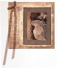
Birthday Card

Birthday Card
Just got a whole lot of new stamps from a brilliant place called the Stamp Smith. This is the image that I first saw on Docraft and really liked. I asked the friend who has used it in an ATC, where she got it. Well she borrowed it from a friend who got it from ebay as a one off. But.... it had a title. I googled the title, and hey presto found the site. They have great stamps and offer a really friendly fast service. I highly recommend them!

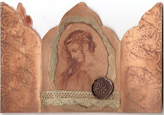
Gothic Arch Trifold inside

Gothic Arch Trifold inside

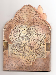
Back of Gothic Arch Trifold

Back of Gothic Arch Trifold

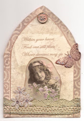
Gothic Arch Within the Heart

Gothic Arch Within the Heart

Gothic Arch, the Key

Gothic Arch, the Key