


Well this month Nikki chose as her theme that everyone should use the 4 things for this month, and this is what she had to say:
For our birthday challenge we thought it would be fun to challenge you to use the products in our DI Travel Bag this month. You’ve seen how the Creative Guides have used the products in the past and you will see how they use them this month too. So join us in using the following products and enjoy the journey!
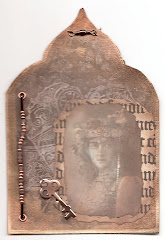
Substrate: Board (eg grey board, coaster board, cardboard)
Main Colour: Lilac or Pale Purple
Technique: Rust Effects (perhaps using rusting or embossing powders or rust coloured paints)
Product: Something Metal
Time for some honesty, - I thought this was quite a challenge, rust technique together with lilac or pale purple??? But, nothing like a challenge right, so this is what I came up with. Below is a short step by step:
I decided to use mount board as my substrate and started adding some texture through a stencil and when dry, adding some pale lilacy colours. I used Paper Artsy Mushroom and Moonlight Fresco Finish paints and mixed a bit of gesso into it too.

Next I added a couple of sprays, to add more interest, - Victorian Velvet and Seedless Preserves.

I also added a few drops of Shimmerz "Before Dawn" for some more interest and did some background stamping.

I think these are both old Prima stamps.

Time to gather some embellishments, the die cuts are all Sue Wilson dies, the flowers are from my stash.

Now for my metal and rusting technique. Well I layered up a little dragonfly over one of the trusty old Tim Holtz ornate frames and put some book paper behind the opening. I then gave it the rust treatment with a mix of paints and a bit of rusting powder too..
Now all that was left was to put it all together.

And here you are, but....somehow it all did not quite hang together for me, so I decided (and this was after it was all mounted onto card already) to give it a bit of mixed media treatment. So I pulled out my Shimmerz spray again as well as the Hickory Smoke spray and carefully sprayed over the diecuts and flowers. I also added some gesso splatter still, so here is take two:

There is not much difference but I'd love to know which version you prefer, so below you can see them side by side:

Here's a close up of the spraying and splattering:

I added the word Friendship still, because all of my fellow design team members have become my friends, many of whom I have met in real life, so a Vintage Journey will always be special to me.
Well, that's it, and sorry for this rather long post.... do make sure to visit A Vintage Journey to see what wonderful new things we have in store for you, (including a fantastic new sponsor for this month yay!!!!) You want to know who it is? Andy Skinner!! And for those of you who don't know him, Andy's mixed media creations are sensational - if you are not familiar with his work do check out his website. Andy has kindly donated a fabulous package to this month's lucky winner which will be made up of his brand new stencils and stamps. But aside from that trust me you do not want to miss the inspiration pieces my team mates have created.
Thanks for your visit here today and stay crafty and creative!!!


40 comments:
WOW, WOW, WOW!!! Absolutely love this Astrid! That stencil is fabulous - can you share what it is? And I adore how you have made use of these colors (and the rusting).....incredible!! You've given mr such great ideas about using die cuts also....I have several of Sue Wilson's dies, but have yet to use them - so thank you! xxx Lynn
I really like both of your versions Astrid - there's such a subtle difference with the added splatter but it really changes the feeling of the piece - maybe it's that the splatter makes it look more vintage and the clean makes it look more modern?? The metal dragonfly looks beautiful over the frame as well! Julia xx
Oh! I definitely prefer version two Astrid. Love those extra little MM touches .. adds so much character to the piece!! Also, the metal embellie on the first one looked very nice but it blends in so much better in version two. Stunning work as always!! xx
Hi Astrid. I think the rusted metal and the lilac go very well together. It's a tough choice between the two! I love both, but differently...maybe it's one of those cases where your mood will draw you to one, or the other. The metal piece is perfect on both!!!
Dot x
Fantastic work. Hugs, Valerie
What a great card, and how nice of you to show us again how you did it!!
I just love this!!!
Greetings
Maria
Hallo liebe Astrid,
ich bin wieder einmal total beeindruckt von deinem Werk.
Vielen Dank für die ausfühliche Erklärung wie du es gestaltet hast.
Mir gefällt das linke Bild besser, für mich ist es total harmonisch und sieht perfekt aus.
Das rechte Werk ist zwar auch sehr schön, aber mich stört das weiß, es wirkt dadurch etwas härter auf mich.
Nur gut das die Gesch,äcker verschieden sind. Ich bewundere deine Werke immer wieder gern. Ganz liebe Grüße Silvi
An amazing piece Astrid! Awesome! You are just unique with your style!
Happy weekend
Susi
and both are gorgeous to me.. maybe I would take the left one if I had to choose.
Just sat here drinking in the beauty of these Astrid! LOVE the pale lilac textured background with the rusted bookplate and dragonfly. Totally dreamy. Jenny x
I always love seeing how you create all the texture on your piece of artwork Astrid and the build up process always interests me and I have to say the colours on this piece make it one of my favourites.
B x
WAUW once again you´ve just made a real piece of Art here. It´s just gorgeous work on both of them, and I really truly thin k it´s hard to pick one for another, as they both have things I really like, so they´re both very very beautiful in different ways. You are a very talented lady, who always make something really cool out of anything you touch.
Have a wonderful week-end ahead here now and lots of great fun too, I hope.
Gorgeous, gorgeous, gorgeous my friend. Thanks for sharing how you created those beautiful layers and how this magnificent piece came together. Having seen both 'finishes' side by side the mixed media spraying is just the icing on the cake for me. Love it.
Have a great weekend.
hugs Brenda xxx
Such wonderful colours and texture on the stunning project
Love Chrissie xx
Just glorious Astrid - the wonderful background and the collaged elements. A stunning design xx
Wow Astrid, it may have been a challenge for you, but you sure nailed it! This is gorgeous and I just love those Sue Wilson dies you used. Beautiful piece! hugs :)
I think both projects are equally beautiful!
Such a great theme by Nikki and you have really knocked it out of the park with this gorgeous creation Astrid. I love seeing how you developed it too. Beautiful work! Hugs, Anne xx
Lovely project!! Both cards are beautiful. I prefer the not so white one. Though I think the person on the receiving end may dictate which I would give.
Oh my goodness, this is stunning! Gorgeous texture and soft lavenders! LOVE the embellies!
This really is wonderful. I agree that the combo may seem challenging but after seeing all the DT samples I am overly inspired and can only imagine creating with this palette now! Love your stencil and awesome layered embellishment. I like the look of the spray, but sometimes white is a better choice. On this piece the spray works! Hugs, Autumn
Totally stunning for someone who doesn't use the colour palette!! I absolutely love how you added the sprays at the end. I think they bring the whole project to a completely different level and tie everything together. Very, very clever Astrid. Julia S-W xx
Fantastically gorgeous as usual Astrid !
Corrie x
wow astrid - this is gorgeous - I love how you have used all the pieces of the travelbag - beautiful x
Astrid - so very gorgeous - thanks for sharing the technique.
I like the left one the most, it brings everything together.with the extra spray en splattering Love the embellishment
gr miranda
They are both beautiful but I prefer the one on the left. Have a great weekend!!
Stunning piece Astrid, loved seeing the process and the finished piece before the extra spraying, which is the winner for me.
Avril xx
Stunning piece Astrid, loved seeing the process and the finished piece before the extra spraying, which is the winner for me.
Avril xx
Such a stunning piece! Astrid and watching it develop has been a treat- thank you for sharing . You have definitely nailed the contents of the travel bag and never would I have thought it would have posed any kind of challenge for you , given what you have created. Love the rusty ornate frame with dragonfly .
Though both versions are fab I would have to say the extra touches of sprays and splats seal the deal for me and take your project to another level.
hugs x
Beautiful Astrid - all of your designs are. What a fantastic tutorial - thank you!
sandy xx
Amazing Astrid, love the stenciled postage stamp, and think I prefer the one to my left when watching her, gorgeous with splashes, shimmer and all texture, you created .
xx,Dorthe
Beautiful Astrid, I love both versions but the spattered and sprayed card is my favourite, you can never go wrong with spattering and spraying! Love your textured background and the juxtaposition of the wonderful rusted frame over top of the delicate white die cuts. Thanks so much for sharing it! Deb xo
Wow gorgeous mixed media design, love it. Fantastic step by step again. Take good care, Shirleyxx
Hello Astrid - long term lurker, always in awe of your creativity. I just had to comment on your beautiful Art work, as I enjoyed the process immensely. Both examples are superb; I would not be able to choose a favourite. TFS
Stunning! Beautiful background and the rusty elements add the perfect touch of grunge!
WOW Astrid, Great project, I really love everything a bout it. What a wonderful Birthday celebration for AVJ. Sandy xx
Definitely with the splatter for my money... it really pulls the whole thing together and gives it such a subtle vintage softness over the cleaner lines of the earlier version. I love the rusty ornate plate with the dragonfly and fab book page interior - just that adornment alone is enough to make me happy! - but I love the soft subtle tones of your background too - beautiful!
Alison x
Astrid you always create amazing art. This one of today as well. I love what you created. I dont see any problems in mixing purple and rust...lol.. You just showed that it works perfectly.
You ask us to tell which one we like the best... With or without splatter. I find it hard to decide. I like both.
As many above said :the metal TH frame with the dragonfly looks amazing.. Gorgeous idea to put a dragonfly inside that lovely frame.
I really enjoyes the contrast between the Sue Wilson romantic die and the grungy background and metal embellishment. Looks great when mixing those.
Thank you for sharing your fabulous art. I always feel so inspired when visiting your blog.
Hugs from Monica... Spain
Oh yes Astrid!
I am so with you on the added spays and flickers- much more your style as well as mine! heehee Sometimes, we just need to step back and then go for the gusto! I just love the way you married all of these elements, that I would not have thought to work as well- gorgeous my friend! xo
Post a Comment