Monday, 27 June 2016

Creating substrates and an experiment

Hello all and thanks for dropping in. I am still hugely enjoying doing an online class with Kate Thomson called Children of the Wild. In one of the many videos Kate shows how to make amazing mixed media backgrounds and I had great fun experimenting. Here is a little portrait I did on one of them.

The backgrounds are very textured, so doing the portrait straight on top, was not easy, I think a next time I would do that differently. But, - you live and learn. Below some further substrate examples:
Kate suggests to do these on old ledger paper, but I don't have any of that, so instead I used some 12 by 12 scrapbook papers with a ledger like background. As the techniques are part of the class, I can't really share them, but here are some more samples:
I used chalk paints mostly Decoart and Paper Artsy and played around with a muted colour palette which I think suite these techniques so well. Obviously stamps and stencils play a part as well.
Kate's site is called Fractured Angelics. I so love the "fractured" elements she uses in her work and shows examples of in her class.
Here is a smaller piece, started as a 12 by 12 and then cut into smaller parts. I incorporated more blue and quin. gold in these ones.
Here is another cut part of the same piece and my portrait was done on one of the other smaller pieces.
Here you can see just how much texture there was on the substrate, - kind of obvious it was going to be hard to draw straight onto that, but I just had to give it a go. I used pencil, stabilo All and tinted charcoal for the drawing.

This is probably my favourite bit of the piece, I love how the colours work against the stencilled bits.

Anyway, that's it for now, I'll experiment some more, so stay tuned :o).

Thanks for your visit like always and have fun with being creative!
xxx

Friday, 24 June 2016

Children of the Wild part two

The course I was telling you about in my previous post is all about children and their connection with animals using loads of cool mixed media techniques (the main reason why I decided to do this course).

In the lead up to the full project, there are several practice exercises, using different materials and techniques. Last time I chose to do a child's portrait to practice (I love drawing/painting children's faces), - I am pretty hopeless at doing animals, so in a way that was a cop out. So here are my next two studies/practice pieces, this time using a wild cat....
For this one I used Kate Thomson's sample painting and just drew along with her video.I used lead pencil, Stabilo All pencil, white acrylic, gesso, black India Ink, white soft  pastel crayon. We were meant to use a white oil bar, but I don't have those, so just using what I have.

Here a coloured version, for this one I used a reference photo, again I did not have half the stuff we were meant to use, so used what I had, pencil, Stabilo All, White acrylic and various soft pastels, a white gel pen and a black permanent pen.

It's really good practice to do the same animal in different ways, you get a much better feel for them.

Thank you for indulging me with my arty efforts, hope I am not boring you to tears. The link to the course can be found in my first post on this topic.
Nearly the weekend, I am feeling a bit desperate about the results of the referendum here in the UK, but democracy has ruled and now we will have to live with the results. Hope you have a good weekend!
xxxxx

Wednesday, 22 June 2016

Children of the Wild

Hello all, just a super quick post from me today as I wanted to share a first project that I did from a new online class I plan to really get into over the summer. The Class is called Children of the Wild, by Kate Thomson, hence the title of my post.
The class can be found on the Jeanne Oliver Ning site, - here is a link: http://jeanneoliver.ning.com/group/children-of-the-wild

I have only watched the first video, and this was just a little bit of fun play, using an inspiration photo she shared and just part of her very first technique. I did the little portrait on an old tag that was flying around.
I just used, gesso, a normal HB pencil, a Stabilo  All pencil and a mix of gesso and white acrylic paint. Kate uses way more products in her sample piece and I hope to get into that soon.

Well that's it, thanks for dropping in and see you next time!
xxxxx

Monday, 20 June 2016

Minibook number two

Hello all and thanks for dropping by. Today I am sharing the first part of a second little mini I am making as a little gift for another crafty friend I am going to meet in a few weeks time. Today I will show you the cover and first double page:

This is the front cover using very similar techniques to the ones I shared about a week ago. If you missed it you can catch it here

I used Pion design papers and altered them using inks sprays texture paste and embossing.
The letters were cut with the Tim Holtz Wordplay die, using canvas paper.
Along the spine I added an extra strip of paper, for strength and to hold it all properly together. Along the side I added an embellishment cluster, using some Calico Craftparts, a few flowers and a little metal time piece.

The faux stitching is a stamp from 49and Market designed by my Shimmerz teamy Gabrielle Pollaco. The little dove was part of a TCW stencil, stencilled with Grungepaste.
The first two pages inside, using the same techniques again and papers by Pion Design. Making these little books is such a good way to use up all those bits of paper I have been hoarding...
Here is the left page. The flowers are scraps of the top layer of a paper napkin, blended into the background as much as possible.

The word explore was stenciled again, this time using a stencil by Gabriele Pollaco.

And here the other side. Again a piece of Pion Design Paper with additional elements added.
Some paper flowers chosen to blend with the background flowers.
The butterfly is from the top layer of a paper napkin again.
I embossed two corners of the paper with a strip embossing folder and highlighted the raised areas.
And here finally the back cover. I fixed some dyed seam binding underneath the cover papers, always an easy way to close a little mini book like this. And that is pretty much it for today.

Thank you for your visit and I hope that the weather where you are is a little better than it is here in Scotland at the moment. We have not had much of a summer so far.
xxxxx

Sunday, 19 June 2016

A card for someone very special...

Hello all and thanks for dropping in.
Today I am sharing a card for someone very special on the Shimmerz blog, so like usual just a little preview here:
This card was created in response to a request from someone on Facebook that a friend told me about. I really hope you will check it out, you can find it on Facebook here:. And if you join in, even better.

Anyway to see my card please click HERE.
Thanks for your visit like always and have a great week!

Wednesday, 15 June 2016

Tag Tutorial and June Freebies

Hello everyone and thank you for dropping by here. Today I am sharing the second part of my tutorials for newbies by popular demand, this time altering a tag with a quick step by step. This is what the finished tag looks like:
I have also created some papers you can print. These are specially designed so you can use them for making tags like this. I left the middle part quite blank and light, so there is plenty of space for stamping and adding colour. I don't have a colour printer at the moment, so for my tag I used a paper from Pion Design. Here are the papers which you are free to use for any project you would like. They are designed to print out on 8 x 8 and will work best if you print them on smooth card stock.


Alright, on to my tag, - it started out looking like this, - cut from a 12 by 12 paper using the Tim Holtz large tag die which comes out as a size 8 tag,
My first step was to run the bottom half of the tag through an embossing folder.
I used three different colours of Distress Inks to colour my tag, Scattered Straw, Fossilized Amber and Seedless Preserve, trying to find colours that would match the flowers that were on the paper
Start with the lightest colour and using a blending tool colour lightly around the outside of the tag, working your way slowly towards the centre.
Do a bit of text stamping with the same colour of Distress ink to add a bit more interest to the background.
Deepen the colour with your next darkest ink, again blending carefully from the outside in with small circular movements of your blending tool.
Adding the third colour and some stencilling with the second colour, plus some further background stamping, this time using a swirl stamp. The final step in the colouring process was to go around the outside of the tag with Ground Espresso Distress Ink..

Time to start thinking about embellishments. I used some Ideaology pieces and a fussy cut butterfly, but you can use die cuts, flowers, chipboard of whatever you have in your stash.
Play around with placing them on your tag until you are happy with your composition. I placed mine mainly in the bottom right corner, to balance the flowers at the top left.
Now for the final touches, I often add some shadow around some of my elements to add more depth. I found the best way is togo over the area where you want to add shadow with Ranger Glue 'n Seal. This dries completely mat and clear and then it is easy to blend either a Distress marker or any other marker (Faber Castell Big Brushpens work well for this) or a Stabilo All pencil.
I also highlighted the raised bits of the ornate frame with copper coloured gilding paste to bring out the texture.
A bit more subtle background stamping to fill in some gaps in the background.
A  muse token and some died seam binding in matching colour at the top, and the tag was complete.

Well, I hope this was useful for some of you and that you like the papers. They were definitely inspired by the Pion Papers that I used. My TOU are simple, you can freely use these papers for your projects, you are welcome to sell what you have made with them, all I ask is that you don't sell them as they are. 
If you have any questions, please feel free to contact me, I am always happy to answer if I can.
Thanks for your visit like alway as stay inky!
xxx


Sunday, 12 June 2016

Altering Papers a step by step for "beginners"

Hello lovely visitors and welcome to you all. I am sharing the first double page of another little book with you today:
After the last little book I did I was approached by several people whether I could describe in more detail how I go about altering the papers I used for that one. I know many of you will be quite familiar with how to do that, but for those who are just in the beginning of your crafting journey, - here is a step by step on one way of how you can do this.
I start by choosing papers that are roughly in the colour tones of the scheme I have in mind already. I wanted this booklet to be quite grungy and vintage of course, so the Indigoblu Belle Epoque Mixed Media card stack was perfect for this. I used the 6 x 6 size and this is one of the papers and my very first step was to cover each paper with a coat of clear gesso. This adds tooth and seals the papers which are quite glossy..
I then covered the central part with heavy gesso and while still wet dabbed my finger in it to create a stucco like texture.
To make it slightly less stark I then added some Titan Buff acrylic paint, I used the Golden brand here but you could use Decoart Media Fluid acrylics or Distress Paint in Antique Linen or indeed any other brand you may have. Blend it out with a baby wipe, to avoid hard edges.
Next add a few spritzes of a spray ink. I used Distress Stain Spray in Weathered Wood, but again, use what you have on hand. Using a spray adds depth and interest and will highlight textures, but have a baby wipe on hand to mop up any unwanted areas.
Next I added some stenciling along the edges, using a mix of Archival ink in Sepia and Distress Ink in Rusty Hinge. I also did some background stamping, again using Sepia Archival ink. The stamp I used is a Tim Holtz one from the Curiosities collection.
Next I wanted to add some imagery back in. I usually do this either with stamps or sometimes with the top layer of a paper napkin. In this case I used some scraps of rice paper.I adhered them with mat gel medium that makes them almost translucent. I purchased  the rice paper (as well as many others) on ebay HERE. This lady has the best selection I have been able to find!
Time to create some embellishments. This could be anything of course. In this case I stamped and die cut some elements from a Heartfelt Creations collection. I used a previously coloured bit of a manilla tag. After taking this photo I coloured the grapes still with a coloured pencil.
I decided to stamp and fussy-cut a butterfly as a companion piece to the butterfly that was already on the paper. I coloured it with the same colour inks I had used before, Rusty Hinge and Sepia Archival and also added a touch of Paper Artsy metallic glaze for a little shimmer.
And here you can see how it all fitted onto the page. The final step was to add a quote. On this occasion I used a quote from a Cloud 9 collection of clear quote stickers that I have had in my stash forever, but I found you can purchase them HERE . Oh and I also added some stamping around the edge, this is a Limor Webber stamp produced by Indigoblu.
The page on the other side was done in a very similar way. I just added some texture paste through a stencil still and some strips of fabric for texture,  and obviously used some different embellishments.
Here is a close up of the embellishments still so you can see them a bit better.

Well, I hope this was useful for some of you. There are several more pages to follow still but I will keep those for another day. Have fun crafting and above all enjoy what you are doing. You never stop learning!!

Thanks for your visit like always

Related Posts Plugin for WordPress, Blogger...

One World One Heart

Photo

FEEDJIT Live Traffic Feed

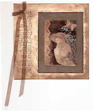
Birthday Card

Birthday Card
Just got a whole lot of new stamps from a brilliant place called the Stamp Smith. This is the image that I first saw on Docraft and really liked. I asked the friend who has used it in an ATC, where she got it. Well she borrowed it from a friend who got it from ebay as a one off. But.... it had a title. I googled the title, and hey presto found the site. They have great stamps and offer a really friendly fast service. I highly recommend them!

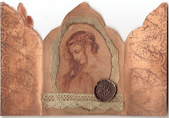
Gothic Arch Trifold inside

Gothic Arch Trifold inside

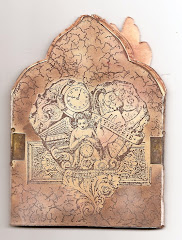
Back of Gothic Arch Trifold

Back of Gothic Arch Trifold

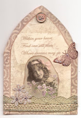
Gothic Arch Within the Heart

Gothic Arch Within the Heart

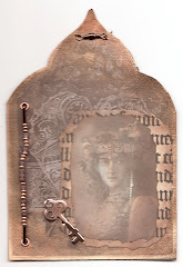
Gothic Arch, the Key

Gothic Arch, the Key