Friday, 30 January 2015

A Fun Request

Hello everyone! Happy weekend and thanks so much for dropping in today!

Just a quick post from me to share some cards I was asked to make using some fabulous new mixed media style embossing folders and stamps from Crafters Companion. The new collection is called the Artist Collection and I loved working with them!
The new products are being launched on Create and Craft this coming week, and trust me, if you are at all into grungy mixed media style stamps etc, you don't want to miss these. I had only a short time to do my samples (I'll show 3 today and some more in the days to come), so I just made cards, but these goodies would be fabulous for journaling, home decor and all sorts of other projects too.

Here are my first lot of samples:
The stamps include all sorts of fun and funky background stamp elements and a brilliant set of grungy words too.The folders have wonderful textures, bricks, wood grain, pebbles etc etc.
Here is a sample using the pebble folder, - all folders are 8 x 8" square, so just so you know, you can't use them in a Bigshot or Cuttlebug as they are not wide enough....
Here is a Valentine's themed one, using a leaf background folder.

Below are details of the shows on create and craft, but of course they are available through Crafters Companion too.


Well, that's it for now, thanks for visiting and hope you will get some creative time!!


Sunday, 25 January 2015

Altered Book page

Hello everyone, thanks for dropping by and for all your lovely comments on my recent Tim makes.

Today I have something totally different to share with you. I finally found the time to do an other page in my altered book:
I am using this book to keep old photographs of various relatives, both of my husband and myself. This page is dedicated to my grandparents on my fathers side.

Unfortunately I never got to know them very well. They were German jews who immigrated to the United States in 1939, they got away from Nazi Germany on one of the very last ships.

By the time I was born, my grandpa had died already and I only met my grandma twice....

Anyway, here are a few closer looks at the pages:
Background created in the usual way with Gesso, various texture pastes and different layers of fabric and lace strips. Added colours with various sprays then some background stamping, plus some collaged and stamped tags and tickets etc.

On this page I added texture paste and while still wet embossing powder and some glitter which was then dried and melted with a heat gun. Below some further close ups:


The metal clock face was first painted with Gesso, then coloured with some Luminarte Silks, a few bits of embossing powder and glitter were melted into it and then it was highlighted with Treasure Gold, as were some of the other embellishments.

I am going to enter this into the following challenges:
Finnabair Sparkle and Shine bloghop and challenge
Paper Artsy Shiny Stuff lots of shiny embossing powder and glitter plus treasure gold.
Mixed Media Monthly Challenge use something new to you. I have never used embossing powders and glitter into wet texture paste, so that was new to me.

Friday, 23 January 2015

For the Love of Tim

Hello all and thanks so much for dropping by here! Today it is my turn to host the latest challenge at A Vintage Journey.

As it's not that long until Valentine's day, this is the description of the challenge:
It being nearly the end of January, it's not long until Valentines day.
A flower cannot blossom without sunshine,
And man cannot live without love.
So the saying goes. For this challenge please share what moves your heart with us, be it a Valentine's card for a loved one, a heart themed project, or something else that expresses what true love means to you. Just make sure that Tim's style is evident in what you make.

Well, in the end I decided not to go the traditional Valentines route, instead I created a project expressing my love for all things Tim....
As you know of course, love can come in many different ways, - there is the passionate "being in love" or the steady enduring love between long standing partners, - there's the love of a parent or grand parent for their off spring, or the platonic love between true friends. Did you know that in Ancient Greek, there were actually 3 different words for love? ἔρως érōs, φιλία philía and ἀγάπη agápē, the latter means spiritual love. Anyway, my love for Tim Holtz and the wonderful inspiration he provides for crafters all around the world, possibly holds aspects of all three.....

But enough philosophy lol, and onto my project.
This year I decided to do my 12 tags on Ranger #8s, - I wanted to design a mini with 12 pockets that could hold them all, so here it is and how I made it.

You will need 4 bits of card that are large enough to be cut to 13" by 10.5"
Score each one at 6.5 along the 13" side and at 3.5 and 7 along the 10.5 side. Cut as shown in the picture below:
Next fold each piece according to Tim's W book. I have shown how to do this many times, as most of my booklets are made according to this principle, I just vary the sizes.. Here is a description.
Once you have folded your card it will look like this:
By adhering the top or the bottom of the pages together (for this one it is best to use something like tissue or washi tape), each piece of card will have 3 pockets. Simply glue your 4 pieces together and you will have created a booklet with 12 pockets just the right size for a size 8 tag.
This is what it will look like from the front and below you can see what it looks like from the top:
As I had to use different types of tissue tape because I ran out and also because it all looked rather messy, I decided to edge everything with black gesso.
For that reason I decided to make the cover and spine  with 3 bits of black card, this is the size you need:
2 pieces of 3.75" by 6.75 " for the covers and 1 piece of 3" by 3.75" for the spine. If you score this piece at 1 1/8" each end along the 3" side it will wrap neatly around the outside of your tag book. But before adding the spine, create something to cover the plain black first.

I used a piece of Manila card for this, cut to 6 1/4 by 3 3/8". I used inks, sprays, texture paste and gesso to create my background. I then rubbed it with Dorland's Wax Medium and then crumpled it up to give it a leather like appearance.
I embellished it with various Ideaology pieces, some letter stickers and two stamped sentiments. The stamps are from the Mercantile set. I then ran the spine piece of card through a little embossing folder and highlighted the embossed bit with Pewter Treasure Gold.
Here are a few close ups still:
Here you can see the spine of the book.
The numbers are from an Industrious Stickers sheet. The laurel wreath is an Ideaology piece, I aged it a bit with some Decoart Antiquing Creams.
The one sentiment is of course Tim's favourite saying, the other is one of my favourite love quotes..

Now one of the fun things with creating a booklet like this, is that you also have the inside pages to decorate. I plan to do that on a monthly basis, really picking up the qualities and colours of the month and the season. So here is my January page:
You can just see my January tag stick out of the back. If you missed it, you can see it here, based on Tim's tag of course.

Well, hope you like my tag book. If you would like to make your own and I have not made things clear, please feel free to email me and I'll be happy to answer any questions.

Almost all of the products I have used are available from Countryview Crafts. And do check out the amazing projects my team mates have created. All you need to do is click HERE

Of course we all hope you will play along in our challenge, so hopefully see you there!!


Monday, 19 January 2015

Tag Monday at a Vintage Journey

Hello dear friends, followers and visitors. Thanks for your visit on this chilly Monday. Today the design team at A Vintage Journey are sharing tags. Please make sure to hop over, there are some amazing samples! Here is mine:
I'll do a quick step by step to share my process with you:
I started with a size 10 tag and covered one side with two different texture pastes, Ranger and Finnabair's Art Extravagance Texture Paste White Sand, I wanted to see what difference there would be.
On the bottom is the Ranger Paste, it dries white and like Tim has pointed out, takes colour almost like paper. At the top the Sand paste dries clear, more or less, leaving you with sand texture. I scraped both pastes on with a palette knife and then pressed an old text stamp into the Ranger paste, for some additional texture.
When dry I sprayed both pastes with a mix of Stormy Sky and Vintage Photo Distress Stain Sprays.
As you can see, they take colour quite differently. Well good to know, but not the effect I really wanted, so out came some Luminarte Silks and Decoart Media acrylics, to blend it all together a bit better.

Getting better and I love the luminous effect of the Silks.
Time to address the other side of the tag:

A piece of old book paper and some more addition of colours,this time with the help of both Distress Inks and some more of the Decoart Paint, to cover the areas of Mat Medium I had used to adhere my paper and which now acted as a resist to the ink.

Next came the embellishments:
One of the stamps from the Classics 19 set, stamped in Coffee Archival and then torn around the edges, plus a butterfly, an old stamp (I don't know the make) coloured of course with the same colours of Distress. I also added one of the Industrious Sticker frames and high lighted some of the textures with my beloved Treasure Gold in White Fire.
.Some close ups for additional elements: rusty pen nib and word band, both Ideaology pieces, along the bottom, together with some Tissue Tape.

A bottlecap, die cut from thick card, coloured first with Vintage Photo, then some Clear Rock Candy Crackle paint and finally some Decoart Antiquing Cream plus a chit chat sticker and finally...
 the Butterfly mounted onto the frame. I went over it with some Decoart Interference paint, which is translucent but adds amazing shimmer. On the photo it looks as if it is all over the place, but I actually only added it to the wings of the butterfly. (I had to use a flash, because it gets dark here so early).

Anyway, that's it. Hope you will hop over to see what my teamies have made, - I promise you will not be disappointed.

Thank you so much for visiting like always and see you next time!

Have a creative week!!


Thursday, 15 January 2015

My version of TT January

Hello lovely people and thank you so much for dropping by here...
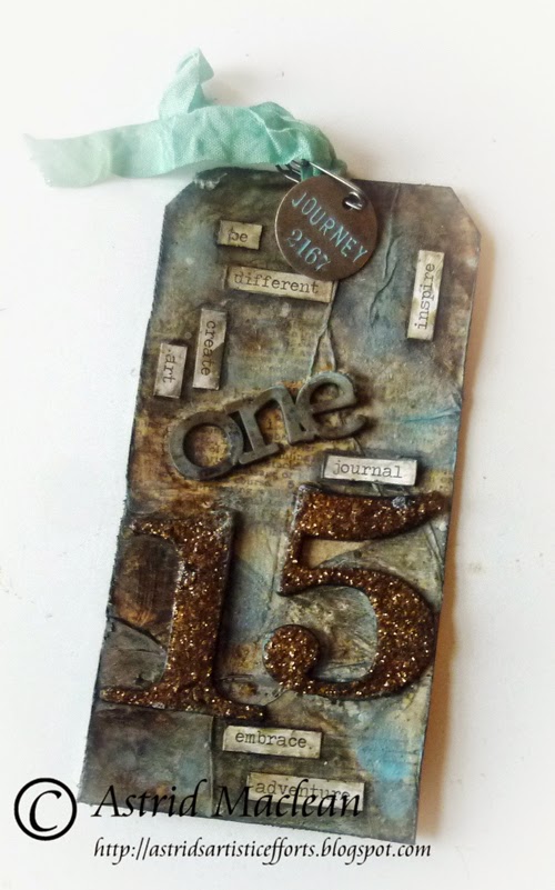
Just a quick post from me today, sharing my version of Tim's January tag:
The original with all the techniques can be found HERE

Now last year I made all my tags as double ones, a size 8 on top of a size 10. This year I am just using size 8 tags. Instead I am in the process of designing a mini book with pockets for each of the tags and a page to decorate to reflect the season. A tutorial for that should be coming your way soon :)

I followed most of Tim's techniques, just changed the colours a bit, used slightly different elements and fewer words. Oh the one stands for January, just in case you are wondering.

Because my 15 is so big, I did not have the space for embellishments, - ah well....
I used Vintage Photo glitter and grunged it all up a bit.
I added shadows like Tim suggests (actually I usually do that anyway, it adds so much more depth).
A muse token at the top was the only embellishment I had space for as I did not want my tag to be too crowded.
Well, that's pretty much it. This tag was not one of my favourites, but hey, nothing like a challenge.

I'll be adding this in the usual place of course.

Thanks for visiting like always. I'll be back on Monday with another tag for A Vintage Journey.

Thank you for visiting like always and see you next time.

Tuesday, 13 January 2015

With thanks!

Hello everyone! So happy you decided to come and visit.

Today I am sharing a tag wallet made as a thank you for a beautiful Christmas tag I received quite unexpectedly.
This is one of my favourite projects to do. The wallet is made from a size 12 manila tag folded in three.

Here you can see it folded open, I'll show both the front and the back:


One of my plans for this year is to join more challenges. Probably one of the most popular ones in the UK is the Paper Artsy challenge. I have never taken part, but this year they are going to have a slightly different format that appealed to me much more and I loved the theme of the first one "Fragile Papers". So I will use this project for my entry to the challenge.
Here's a quick description of how I made this and what I used.
1. I covered the inside of my size 12 tag with a thin layer of gesso, then added scraps of Tim Holtz Tissue wrap and some old book pages using gel medium.
2. Next I added colour with the help of some Fresco Finish paints, I used watered down Chocolate Pudding, French Roast and a little bit of Sage, blending it all with the help of a brush, baby wipe and my fingers.
3. Next I added scraps of the the top layer of a paper serviette. This is not something Leandra mentioned in her description, but to my mind these fit totally into the fragile paper theme and I happen to love using them.
4. Some more paints were added to blend them into the background.
Here are some close ups:
I added some stenciling still, using a Tim Holtz stencil and some Geranium Archival ink. I love how the text on the tissue wrap can still be seen through the paper napkin, - one of the joys of working with translucent layers....

As this is a thank you wallet, I added the word thanks with some letter stickers. Here you can maybe just see how I also added some old book paper and more stenciling of course.

The outside was done slightly differently:
1. I covered the whole outside with Sage Fresco Finish.
2. Next I added some sprays with a mix of Tim Holtz Distress and Lindy's Stampgang Sprays.
3. Texture was added with my favourite stencil of the moment, Memorybox Lathenay.
4. More colour was added with a mix of Sage and Inky Pool paint and another scrap from a paper serviette was adhered to the middle section.

And some more close ups:
The middle section, to which I added a word sticker still
The front flap, with some ribbon and a flower plus a couple more word stickers, sorry you can't read the second one, it says inspired of course.
The wallet closes with a little magnet. I also added a little stamping, using a Prima word stamp, stamped in Sage Fresco Finish. Like usual the texture was highlighted a bit with Treasure Gold, this time I used Pewter and Indigo.

Well, that's it, - hope the recipient will like it (it will be on its way by the time this post goes life). And as I said I will be adding this to the Paper Artsy Fragile Paper Challenge. My inspiration mainly came from Leandra's introductory post and video.
I am also going to add it to the Thats Crafty challenge where the theme is "something Blue"

Saturday, 10 January 2015

New Beginnings!

Hello my lovely crafty friends and a very warm welcome! It has been very quiet here for the last few weeks, but I am now back home so you can expect to see more over the next days and weeks.

I would like to start by saying a big thank you to you all for all your lovely comments and visits. Since I left home I have gained 30 new followers, I feel so honoured that you decided to follow along on my arty journey, thank you for that.

Today I am sharing the first page in a brand new journal:
My lovely talented friend Brenda from Bumblebees and Butterflies started the year with a visual journal challenge. You can read all about it here.

The moment I saw her post after my return, I knew that that was just the kind of challenge I needed to get me back into an arty groove.
Here's a quick run down of how I put my spread together:
1. Cover the centre of the page with white, and the edges with clear Gesso. (I wanted to experiment with the difference in texture with both)
2. Add texture with the help of texture paste and stencils in various corners as well as some crackle paste randomly with a palette knife.
3. Add colour using various sprays, I used a mix of Tim Holtz Distress Sprays and Lindy's Stampgang ones.
4. Use the top layer of a paper napkin to add a focal image, using gel medium to adhere it.
5. Add various background stamps and use some watered down gesso to integrate the napkin into the page.
6. Add more colour with sprays and paint and some washi tape.
7. Finish with a sentiment, and some shadows using markers and a water brush.

Here are some close ups still:
The sentiment was computer generated, shadows were added with some Distressmarkers and a water brush.
Grungeboard numbers, given a metallic look with the help of Stampendous Ancient Bronze Embossing Powder.
A washi banner to give some balance to the bold design of the napkin.
Stencilled texture given the rusty look with the help of Treasure Gold in Renaissance Gold and Copper.

Well, that is it. I had great fun just playing and using some of my favourite techniques, without any dead lines and other obligations. I really hope to do much more of that this coming year.

If you love journaling, or even if you are new to it, - why not play along with us? You can link your project HERE, and players will visit each others blogs to see what we have all been up to, great fun!


Thanks so much for your visit like always, and I hope to see you soon again!!
Related Posts Plugin for WordPress, Blogger...

One World One Heart

Photo

FEEDJIT Live Traffic Feed

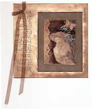
Birthday Card

Birthday Card
Just got a whole lot of new stamps from a brilliant place called the Stamp Smith. This is the image that I first saw on Docraft and really liked. I asked the friend who has used it in an ATC, where she got it. Well she borrowed it from a friend who got it from ebay as a one off. But.... it had a title. I googled the title, and hey presto found the site. They have great stamps and offer a really friendly fast service. I highly recommend them!

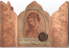
Gothic Arch Trifold inside

Gothic Arch Trifold inside

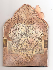
Back of Gothic Arch Trifold

Back of Gothic Arch Trifold

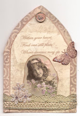
Gothic Arch Within the Heart

Gothic Arch Within the Heart

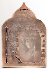
Gothic Arch, the Key

Gothic Arch, the Key