Pages

Friday, 28 November 2014

One for the Birds

Hello lovely visitors and welcome!
It's Friday and every second Friday we have a new challenge over at A Vintage Journey, as most of you will know. Can you believe we are onto challenge 20 already! Wow, how time flies! But this week it's not just time that's flying, because the lovely Chris who is hosting this challenge has chosen "Birds of a Feather" as her theme, and this is what she had to say about the challenge:
Get out your inks, paints, chalks, Gelatos etc and grab your bird dies, stencils, masks, stamps, whatever avian stash you have and conjure up something that sings of our feathered friends. Whatever you create, we want to see Tim's influence clearly identified. Let's see your magic!

So onto my project:
With it being the end of November and the dreaded C word (really I LOVE Christmas), coming ever closer, my project turned into a Christmas gift for one of my crafty friends. It's big enough to hold a size 8 tag inside and there is also a place for a special Christmas message.

Below is a quick step by step with a lot of photos.

1.You need to start with a piece of A3 card, I am lucky enough to have Kraft card in that size, so used that as my substrate as it is so strong. But any card would do. Cut it to 7" (18cm) by 16.5" (41.5 cm).
Fold it in half length wise and then fold each side to close to the middle, gatefold style.


2. Open it out again and then fold the corner of each side down, like you can see in the photo below.


This is the inside view and as you can see, you have created two pockets once you glue the sides, the bottom and corners down, but don't do this yet!

3. For the outside, glue on a ribbon, this will make it possible to close your booklet/folder later.
Time to cover your base card
I chose two different kinds of paper, cut to about a quarter inch smaller than your out and insides.
Here are my approx. sizes:
Outside: 2 times 4 by 6 7/8" (10.3 by 17.5 cm)
Inside: 2 times 4 by 6 7/8" (10.3 by 17.5 cm) in contrasting paper
Inside flaps: 2 x 4 by 3.25" (10 by 8.2 cm)
Corner flaps: 1 time 3.5 by 3.5" (9 by 9 cm) cut diagonally and then trimmed to fit properly.
4. Now the fun begins, altering the papers with inks, stencils, texture paste, sprays, whatever your heart desires:
Below are some photos of how I altered mine:
Wendy Vecchie Crackle Paste through Tim's Latticework stencil
Adding some watered down gesso

Two colours of Distress Sprays: Brushed Pewter and Walnut Stain.

Embossing around the edges of the paper for a special finish. I used Stampendous Aged Silver.
The back cover was done in a similar way, but instead of using a stencil, I just scraped on the crackle paste randomly with a palette knife.
To alter the insides I just used inks as most of them would be covered by the flaps anyway. The flaps themselves were done in the same way as the outsides. Now it is time to adhere your altered papers to your base card and to glue the flaps down to create the pockets.

I chose to embellish with different die cuts and of course a bird!! Below is a selection of what I used:
The 25 was given a metal look with the help of the same embossing powder. The bird is an Artistic Outpost stamp coloured with Distress Inks.

Finally some close ups of the finished project:
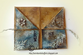
The inside, after I glued down the sides. The embellishment on the left, was bright silver to start with. A quick spray with Walnut Spray ink turned it all aged looking.


Another little bird, one of Tim's ideaology pieces.
Finally I chose one of the tags made for a previous project to fit inside as it fitted perfectly.

Well, that's pretty much it. Make sure to check out the challenge over on A Vintage Journey, where you can see all the amazing projects from my teamies and of course we hope you will play along, for your own creative enjoyment, but also to be in with a chance to win a fab voucher from our sponsor Country View Crafts

Thank you for visiting like always and have a great weekend!


Wednesday, 26 November 2014

Tag time and happy mail!

Hello everyone and lovely to have you visiting! Welcome to followers old and new.
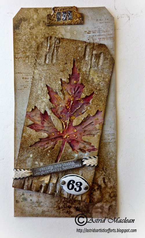
Today I want to share my Tim Holtz November tag. The original can of course be found HERE.
I followed Tim's instructions pretty much exactly, so I won't go into how I made it as you can read all about that on Tim's blog. I just used a different colour scheme, as here in Scotland, the Autumn colours have pretty much disappeared, so I kept it more wintery. The colours I used were Antique Linen, Pumice Stone and Aged Mahogany, for the background, and Walnut Stain and Brushed Pewter on the corrugated card.
I don't have the Ranger foil, so I used Pebeo instead, it's actually much lighter gold than it came out on the photos, so really goes quite well with the pewter colour, even though I normally would not mix gold and silver....

I did not have the embellishments Tim used, so used a word band and enamel number instead.

I decided at the beginning of the year to mount all of my 12 tags on a larger size 10 tag, so stuck with that idea, here is the background to the larger tag:
I painted the tag with Snow White Fresco Finish paint and then spritzt with Brushed Pewter, Iced Spruce and Walnut Stain sprays and did a little bit of background stamping too.

I cut a little tab for the top with the tiny tags and tabs die out of silver Mirri card and then aged it with Brushed Pewter and Walnut Stain sprays. When I heat set it, it started to bubble and gave a cool metal effect, - great new discovery that..
I added the month with the little Tim Holtz letter stickers, sanding them a bit first to distress them, a cool trick I learnt from the wonderful Paula Cheney a while back.
I adhered the smaller tag onto the larger one at a slight angle and that was pretty much it.
Now while I was at it, I decided to turn the leaf which had been cut from corrugated card into a Christmas card, using a very similar colour scheme:
I decorated the inside of my card in a similar way as my previous set of cards, as all the stamps etc were still on my desk.
Well, that's it for today. I'll be back on Friday when there is a new challenge over at A Vintage Journey.

I am of course adding my tag to Tim's Tag Challenge for November. Not much time to spare, but at least I made it...

Now to the Happy Mail: A while back I did some translating for the wonderful Dagmar, who lives in Germany and struggles with English. Well, look what arrived in the post a couple of days ago:
This stunning tag! It was a project she posted on the Countryview Challenge blog as she was a winner and I helped her translating the description, it's so stunning!
But, that was not all, look at this:
A stunning little folder, not only beautiful, but practical too, for inside it looks like this:

There is a space to keep notes: Gift ideas, To do list,  shopping list and Christmas cards.
Such a clever and practical idea.


And last but not least, a lovely little desk calendar booklet:
Love the mail art style of the covers!
Here is the inside:

Thank you sooooo much Dagmar!!!

Well that is it for now. Have a fantastic week everyone!!

Monday, 24 November 2014

The beautiful Lily Grace

Hello everyone and a warm welcome, thank you for taking the time to look in here. Today I am sharing the next page in my altered book, a page around the beautiful Lily Grace.
Lily Grace, or Grace as she was known, was my husband's great grandmother, this shows her in 1880.
I adore the expression in her face, to me she looks like a real charmer, dreamy and romantic. She would give birth to 5 children 4 girls and a boy. Unfortunately I have no photo of her husband, but I keep hoping he will have looked a little bit like his brother, whose photo you can see here.
People are always asking me how I put my pages together, and I promise, I will do some full step by steps in the new year. Meanwhile, here are just a few "along the way" photos:
I covered the next double page in my book with some Tim Holtz tissue wrap, followed by a thinish coat of gesso. When that had dried I coloured the page with a mix of different acrylic paints (Tim Holtz Antique Linen, Paper Artsy paints in brown tones, both opaque and translucent) I used a brush and both a baby wipe and some kitchen roll to blend them together. I call this the wipe-on-wipe-off method. With the gesso underneath you can easily blend and merge the colours as long as they are still wet and with the help of the kitchen roll add additional textures to the paint.
 Here you can see the different textures a bit better, achieved through the tooth in the gesso and the kitchen roll bunched together and pounced on the wet paint. When the paints had dried I sprayed on two colours of Sprays: Lindy's Stampgang Starburst spray in Bodacious Blush (what a name lol) and Tim Holtz Victorian Velvet. They both have wonderful old vintage pink tones and the star burst just adds a little sparkle.
Anyway, because I wanted a really romantic feel to these pages I then added the top layer of a rose tissue, a packet of which that I was lucky enough to find in a stationary shop.
I used Ranger Multi Matte Medium for this, my absolute favourite of the moment, because it really dries totally matte and has the perfect consistency.
I had this notion of Lily Grace writing romantic love letters so I stamped a number of vintage writing stamps on some tissue paper.
I stamped quite a few, just to have a choice and then selected just three to adhere to my page, tearing around the edges to avoid hard lines.
I could have left it at that, but could not resist the temptation of adding some more texture to the page with the help of some stencils. I never seem to learn the lesson of "less is more"....

By the time the texture paste had dried it was dark, so I could not take any more step by step photos.... (it gets dark here in Scotland just after 3:30 at the moment :o( )
So all I can show you now are some close ups of how I finished the page:
I mounted the photo of Lily on to some tags and other stamped elements and embellished with some flowers, sprayed with a mix of glimmer sprays. I also did some more background stamping with a little Prima stamp and added her name with the little Tim Holtz letter stickers.
Sticking with the love letter theme, I rolled up a bit of old book paper, tied it with some vintage lace, tucked in a little flower and added some other flowers underneath. Everything was adhered with the Ranger medium.

Well that was pretty much it. The page is probably a bit over the top, but then I think Lily was quite a full on lady.....
Sorry this post got a bit long, but for those of you who asked, I hope it has given you some idea of how I put it together. Hope you are having a good week and that you will find some time to be creative!

Thanks for visiting like always


Friday, 21 November 2014

Vintage Mixed Media style

Hello everyone and welcome. It's been a bit quiet here this week because I have been busy prepping and scheduling projects for the time I will be away over Christmas, (off to see my grand children in Australia, - can't wait!)

Anyway, all I have to share today are a few more mixed media Christmas cards. Sorry, not very exciting really... but here goes:
These are not all that dis similar to some earlier ones I did, but on a slightly larger format.

The background was done with a Trimcraft paper line I found in the Range of all places, it's called Gilded Winter and has some stunning papers in it. But of course I could not leave them as they are so played around with texture paste and various sprays. For this one I used the Lathenay stencil from Memory Box, a Lindy's Stampgang Spray,  as well as Bundled Sage and Walnut Stain Distress Sprays. Raised bits were dry brushed with Decoart Dazzling Metallic Luminous Gold, and Treasure Gold in White Fire.
The little snowflake in the centre is paper clay, I made it with a sugar craft mold.
I did some background stamping to add a bit more interest to the background still, the little vintage image is from Maja Design Winter Frost basics.

Instead of adding a sentiment to the outside, I did an inside page, also to show up behind the decorative edge of the card:
The wonderful sentiment stamp is from Stampendous, the snowflakes are Tim Holtz.

I did two further cards in a very similar way:
This one uses a Dyan Reaverly stencil and another image from the Maja design papers. The inside is similar too, - I have so many cards to make, I quite like doing them in a series.
And the final one in blue tones:
This photo is terrible, it gets dark here so early, I had to take it with flash, - it is so much nicer in real life.
And the inside:
Right, that's 3 more to be ticked off the list, hope you think they are ok......

Thank you for visiting like always and have a fantastic weekend.

I'll be running a children's card making workshop this Saturday. for our school Christmas Fair, so a busy day ahead....